Icons page redesign #1840
Icons page redesign #1840
Conversation
|
PF3 preview: https://patternfly-org-pr-1840-v3.surge.sh/v3 |
 redallen
force-pushed
the
chore/1687-icons-page
branch
from
redallen
force-pushed
the
chore/1687-icons-page
branch
from
e2b5f83 to
44b900f
Compare
|
Rebased on |
 evwilkin
force-pushed
the
chore/1687-icons-page
branch
from
evwilkin
force-pushed
the
chore/1687-icons-page
branch
from
2eb5299 to
2ae044d
Compare
 - gatsby-theme-patternfly-org@1.4.19
 - patternfly-org-4@3.52.31
 - gatsby-theme-patternfly-org@1.4.20
 - patternfly-org-4@3.52.32
 - gatsby-theme-patternfly-org@1.4.21
 - patternfly-org-4@3.52.33
- patternfly-org-4@3.52.34
- patternfly-org-4@3.52.35
…ot for large icons
 - gatsby-theme-patternfly-org@4.0.10
 - gatsby-transformer-react-docgen-typescript@4.0.3
 - patternfly-org-4@4.0.11
* fix(org): update to RC1 versions

* add back doc search

packages/v4/src/content/design-guidelines/styles/icons/IconRecommendations.js
Outdated
Show resolved
Hide resolved
packages/v4/src/content/design-guidelines/styles/icons/IconRecommendations.js
Outdated
Show resolved
Hide resolved
packages/v4/src/content/design-guidelines/styles/icons/recommendations.js
Show resolved
Hide resolved
|
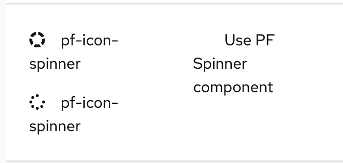
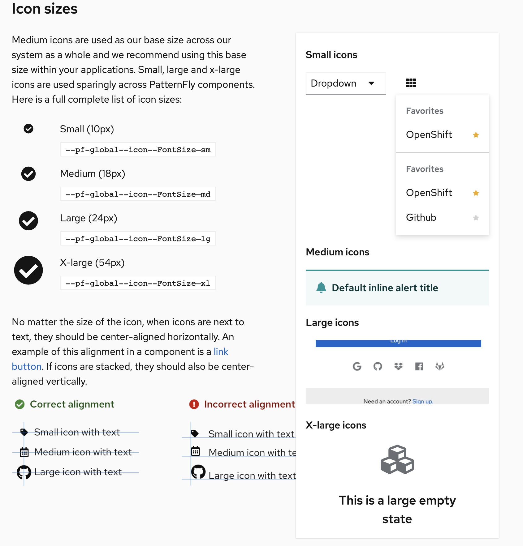
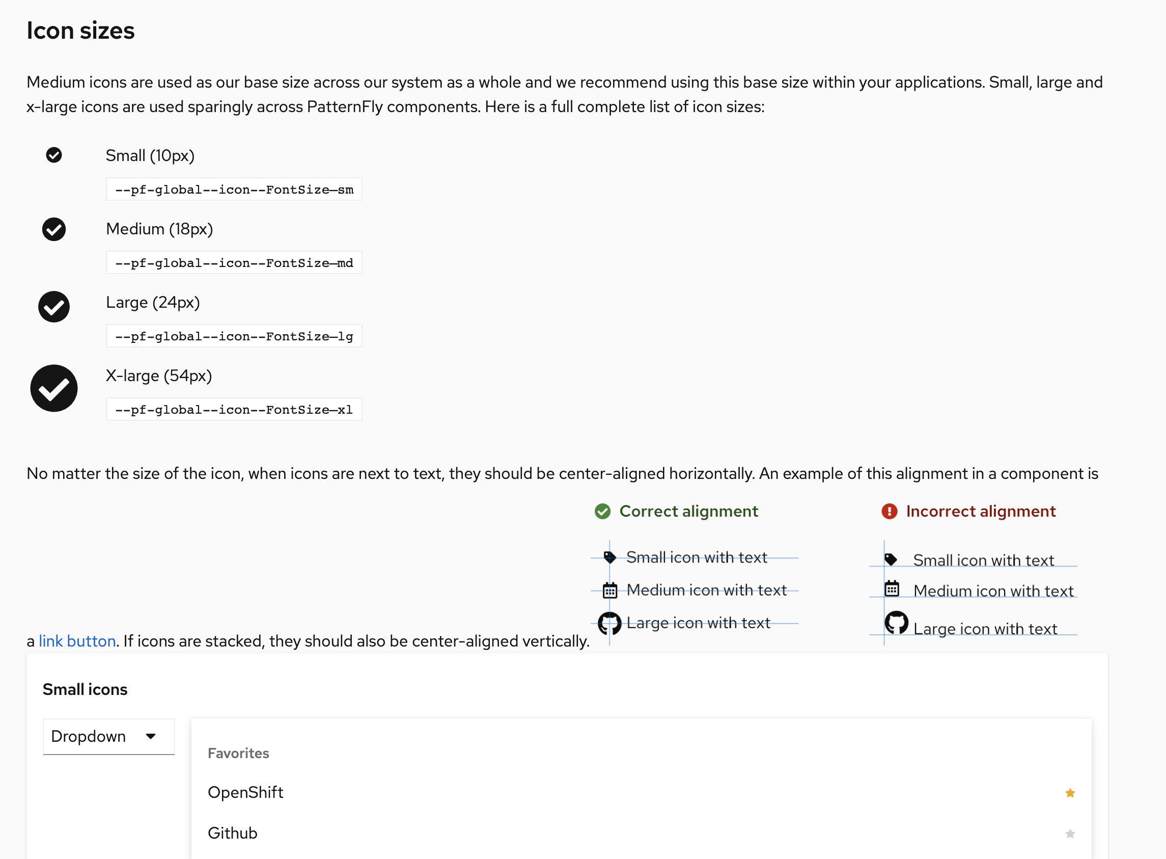
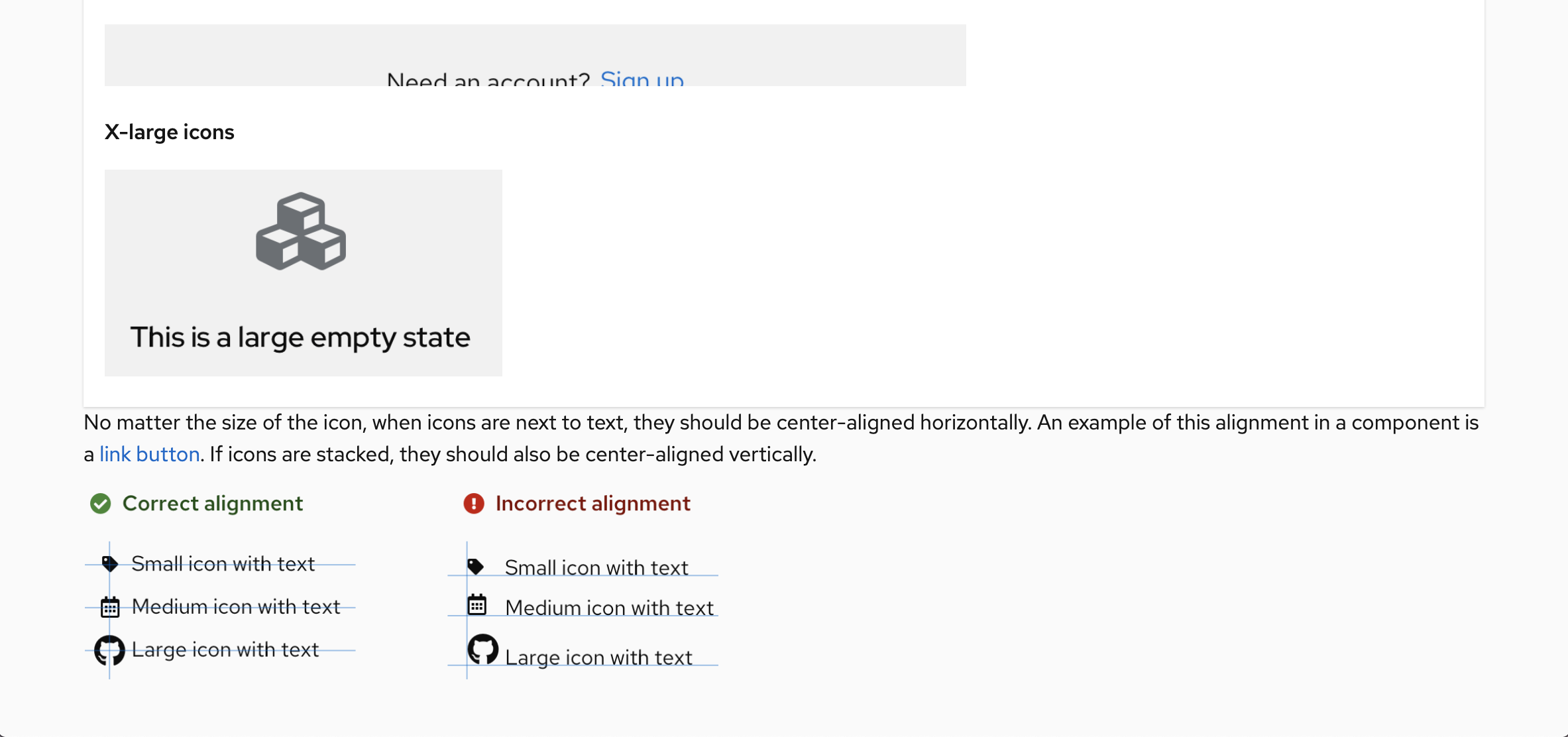
Under "small icons", the dropdown toggle example - is the down arrow supposed to be small? If so, it's 16x16. The App launcher menu beside ^ dropdown is a Under "medium icons" the alert has an Under "x-large icons" the empty state has an Also, the presentation of the small/medium/large/x-large icons box where we include these examples seems a little odd. One of the examples is a screenshot. IMO, they should all be screenshots. That would give you more control over their presentation and you won't end up with the problem of those examples having invalid markup for their role on the page. Here's what it looks like when the nav is hidden, since they're regular html/css and are responsive. It also shows how we need some space between the alignment screenshot and this example box.
And here is the screen right before the nav is hidden, showing the small/medium/large/x-large example box overlapping the alignment image in the left column.
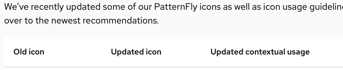
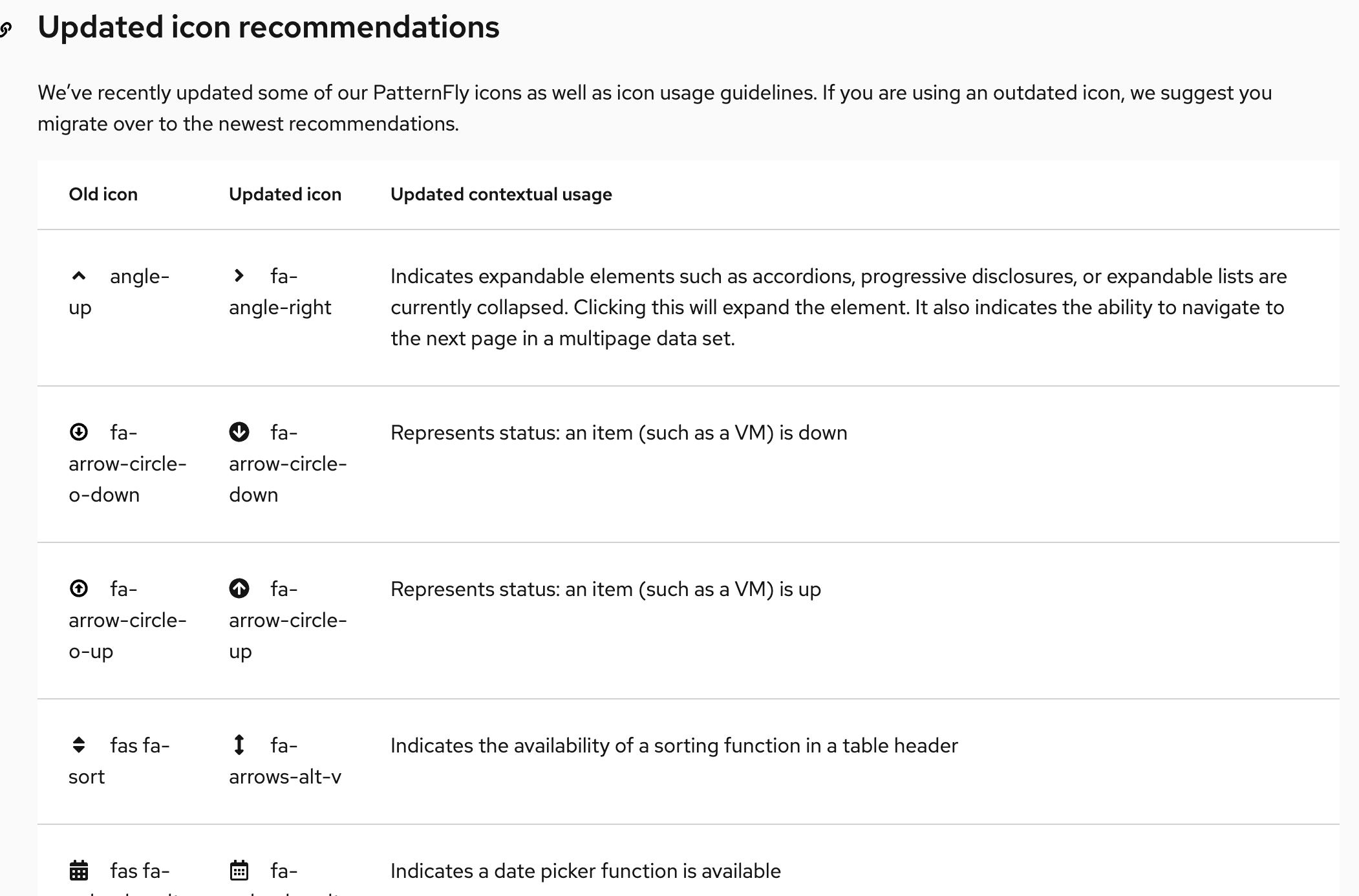
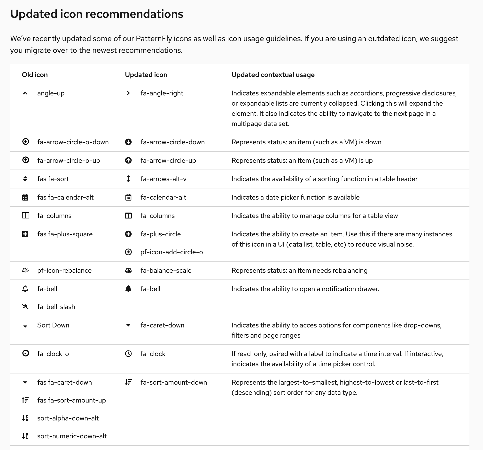
A user would have to bundle their own font-awesome regular package for this to work since we only ship the font-awesome solid webfont. Is that noted anywhere? In the "Updated icon recommendations" table, the way the names wrap is kinda hard to read. It also doesn't present the same as the "all icons" table above it. If we kept the icon/name cells from wrapping and made it a compact table, I think it would work a lot better. Old:
New:
|

|
@mcoker @evwilkin I wasn't aware of the dropdown not using the small sized caret. I switched that example up with our new labels instead so we don't have to worry about that. I ended up zipping together screenshots of what we can use per icon size and attached them here! I have a couple comments on the responsiveness of the page:
Everything @mcoker said above covers anything else I was seeing with the table! @mcoker To answer your question about the fa regular icons - we provide a link back to this page: https://www.patternfly.org/v4/get-started/developers#using-styles for that. We need to add some more text there for:
Is that something we should open another issue for? |
|
The page is looking great! I have some feedback: In the intro text for the icon table, we should link directly to the FA Free filtered set, since that's the only subset of Font Awesome we can use. https://fontawesome.com/icons?d=gallery&m=free "PatternFly uses custom icons and selections from Font Awesome Free. PatternFly icons are mostly two dimensional and flat. Navigate to Font Awesome’s website to download SVGs of any additional ‘fa’ icons within their free set. Proper attribution should be given as outlined on the Font Awesome site. Click on any single icon in the table to download it as an SVG. Download all icon SVGs here."
I was under the impression that the only limitation we had for Font Awesome was whether or not it was in the "free" set. I didn't think it mattered if it was a solid or regular icon. Was there a reason why we're not including the regular icons? That will really limit our options. Two icons marked as regular (far) on the test page are showing the solid versions in the table (the other regular icons seem ok. Here are the two showing the solid versions:
The regular versions of these icons used in the design kit, so there's a mismatch. There aren't many we use, but they are part of the recommendations. New Recommendations table:
Thanks for all the hard work on this page! It's looking great! |
…ed alignment img onto its own line
…how when there are multiple updated icons in one row
|
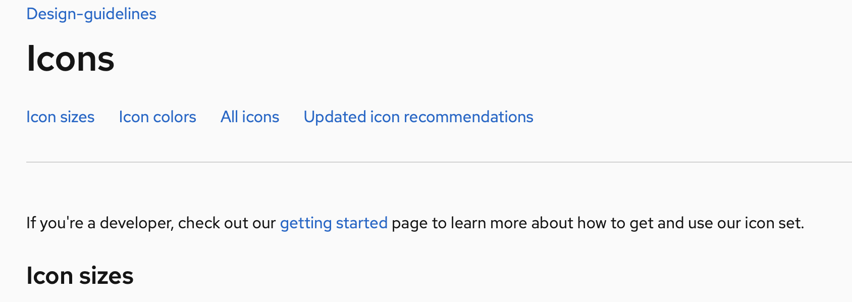
Is this "design-guidelines" at the top going to go away? |
There was a problem hiding this comment.
@evwilkin this looks SO great - I found only 4 things that need to be updated:
- The responsiveness when breaking the card below the icon size text, right when it breaks, there is no space between the bottom edge of the card and the text following. Can we bump it up to match what it is when you shrink the screen a little smaller? (24 px)
Screenshot of the spacing right after breaking:

-
The "getting started" link in the beginning is broken (should link to https://www.patternfly.org/v4/get-started/developers#using-styles - I think it already is so not sure what's going on)
-
The "how to get started with icons" link within the All icons text section is also broken (should link to https://www.patternfly.org/v4/get-started/developers#using-styles - I think it already is so not sure what's going on)
-
The "Spinner component" link isn't going anywhere - should link to https://www.patternfly.org/v4/documentation/react/components/spinner
@rachael-phillips removed this, thanks! @gdoyle1 I've updated the responsive breakpoint. The broken links should work as expected when live, this is a known issue in Org with the preview site combined with internal relative links. |
|
Just verifying that all the fixes were completed based on my comment from last week. Great work everyone, it looks fantastic! Thanks! |
7 participants
Closes #1687
This PR rebuilds the icons page based on redesign & updated icon recommendations.