feat(Select): add checkbox select variant #1487
Conversation
|
PatternFly-React preview: https://1487-pr-patternfly-react-patternfly.surge.sh |
Codecov Report
@@            Coverage Diff             @@
##           master    #1487      +/-   ##
==========================================
- Coverage    82.8%   82.72%   -0.09%
==========================================
  Files         591      594       +3
  Lines        6550     6594      +44
  Branches       75       75
==========================================
+ Hits         5424     5455      +31
- Misses       1096     1109      +13
  Partials       30       30
Continue to review full report at Codecov.
|

|
Hey @kmcfaul looks good! Compared to the core example...
Is there any reason you wouldn't match this structure in the react component? @jgiardino looking at this, do you agree that we should create an issue in core to update |
|
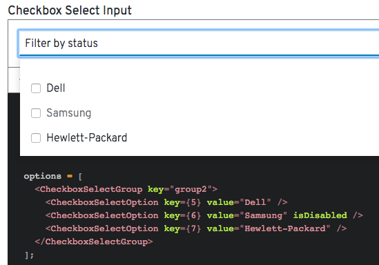
Great work on this, @kmcfaul! There is currently a PR open in core to change how Would it be possible to follow what's done in that PR even though it isn't merged yet? This PR doesn't change the css, just the html structure to use separate fieldsets for each section of checkboxes. When there are a group of checkboxes, the best way to group them is with a
I would stick to the updates in that core PR, rather than incorporate section and h1 elements, since they would provide no added benefit. The h1 would be ignored due to |
|
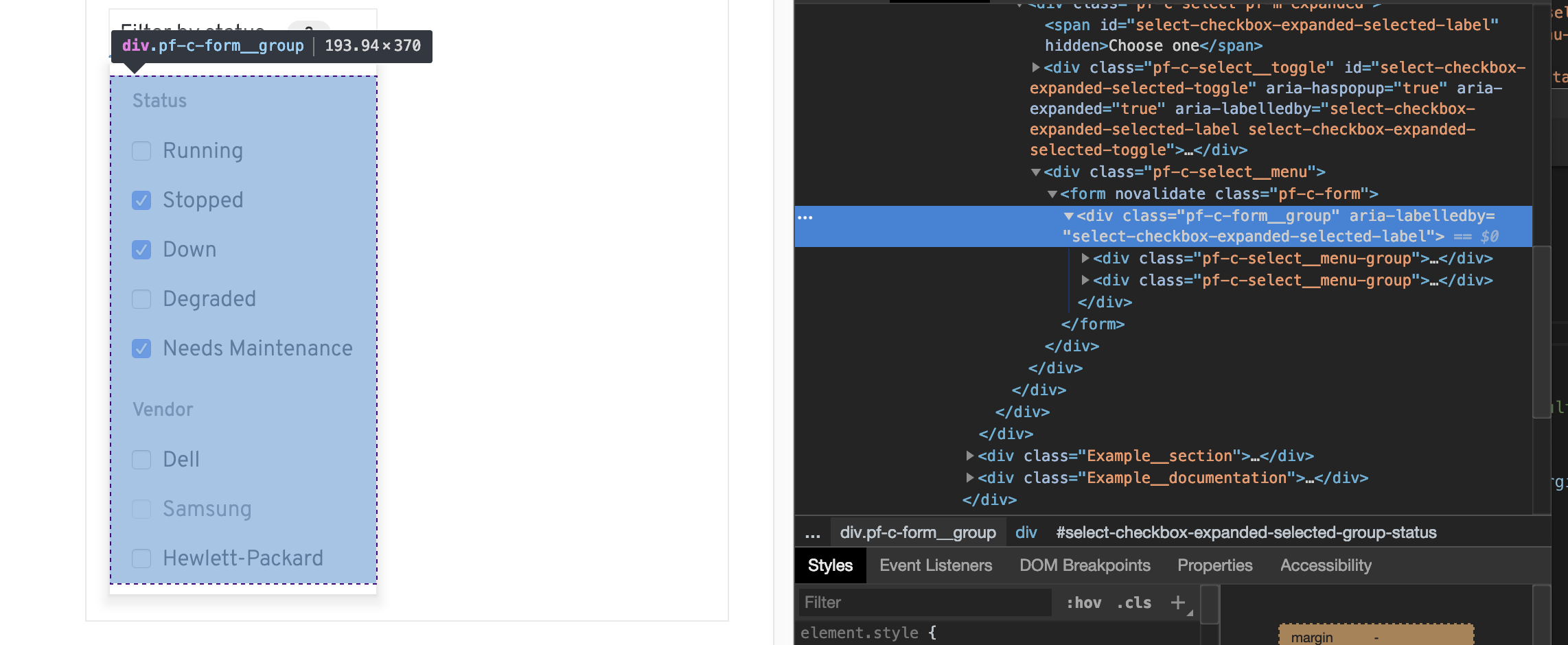
Is this component also expected to work when there is just one group of checkboxes? I removed one of the groups, and removed the group title, and it rendered like this. This is actually very similar to the example in core, except that there's this empty div that adds extra space:
In this case, if the consumer has a single group with no label, then can we pull the |
| className={css(checkStyles.checkInput)} | ||
| type="checkbox" | ||
| onChange={event => { | ||
| if (!isDisabled) { |
There was a problem hiding this comment.
There should also be a disabled attribute on the <input>.
|
Looking at the aria-labels, there are a couple of things I notice:
|
|
@mcoker I will address these. I was following the integration document for structure at the outset and may have misread it. For the toggle, I had read it as using the Badge component and didn't want to couple the components, but now I realize I can create a span and reuse the classes instead. @jgiardino For only one group of checkboxes without a label, the implementation would use an array of The I will add the hidden title as in the SingleSelect example. |
|
@mcoker It looks like adjusting the badge html has some side effects, seemingly due to the width being set for Select. The toggle contents are justified so the badge floats more or less in the middle opposed to a specific side.
If I put the badge div under the toggle wrapper it floats closer to the text, but I'm not sure if it should be close to the text or to the carat.
Thoughts? |
Oh, I see. For this component, I would suggest leaving the prop out, and only providing |
|
@kmcfaul Ah, unfortunately that's a bug in core, too.
My inclination is to match what's in core, even if it's broken, then we can fix it in core and hopefully it's just CSS that will fix it here. I mentioned this to @christiemolloy in an open PR about select - patternfly/patternfly#1527 (comment) Either we'll fix it there, or once that's merged, we'll follow up and fix it then. |
|
@mcoker For the fieldset html structure change, it looks like there's now a grid gap between groups from the wrapping form. Is there something I can do to suppress it or is an expected adjustment? @jgiardino For the aria changes in the fieldsets, I'm using the group label as the aria-labelledby property of each fieldset (and when there are no groups, the previously passed in aria-label is used). |
Looks like you're missing a
|
 kmcfaul
force-pushed
the
checkbox-select
branch
from
kmcfaul
force-pushed
the
checkbox-select
branch
from
092e8a9 to
67759d7
Compare
This approach sounds good. I just have a couple of comments/questions:
|
| isExpanded?: boolean; | ||
| isGrouped?: boolean; | ||
| onToggle(value: boolean): void; | ||
| placeholderText?: string; |
There was a problem hiding this comment.
We need to maintain the API and not cause breaking changes because we are not ready for a major release.
There was a problem hiding this comment.
Sounds good, will revert that until we can change the API.
| @@ -1,12 +1,18 @@ | |||
| import { Select, SelectOption } from '@patternfly/react-core'; | |||
| import { Select, SelectOption, CheckboxSelectOption, CheckboxSelectGroup } from './index'; | |||
There was a problem hiding this comment.
we still want o import fro @patternfly/react-core
| )} | ||
| {variant === 'checkbox' && ( | ||
| <React.Fragment> | ||
| <SelectToggle |
There was a problem hiding this comment.
can this SelectToggle be made common between the two variants?
There was a problem hiding this comment.
Yeah I can make it common, I was split between doing that or maintaining one switch type logic for getting the right variant.
kmcfaul
force-pushed
the
checkbox-select
branch
from
67759d7 to
7aaa18f
Compare
 dlabaj
left a comment
dlabaj
left a comment
dlabaj
left a comment
There was a problem hiding this comment.
Can you update the broken JEST Tests?
|
@rachael-phillips This looks good from a design and mouse interaction perspective except for the CSS issue on badge positioning. But looks like there still may be some keyboard interaction issues @jgiardino ? |
also remove console statement from select
…oggle content badge
revert title name change, move group id, refactor common toggle, add grouped checkbox example
|
I tested the latest updates. The keyboard interaction works as expected! Thanks! I did notice while reviewing that there are some weird behaviors when a menu is visible, and I scroll and click another menu. The page will scroll back to the menu that was previously visible. I'm doing one more review of the aria attributes that are defined, and there are a few that need to be modified:
|
 jgiardino
left a comment
jgiardino
left a comment
jgiardino
left a comment
There was a problem hiding this comment.
Thanks for making updates! Everything looks good to me!
|
@christiemolloy @mcarrano Is this all set for UX / CSS review? |
|
@kmcfaul can you move the badge into the |
 christiemolloy
left a comment
christiemolloy
left a comment
christiemolloy
left a comment
There was a problem hiding this comment.
LGTM, ill wait for @mcoker to add the CSS/UX tag
|
Looks good @kmcfaul Changed to 'UX Approved' |
|
cc: @aljesusg - do you mind giving this a look and seeing if it fits your use case? If not, maybe we can start an issue, but terrific job exploring this w/ the selector pattern in Kiali 👍 |
10 participants
What: Adds checkbox select variant component.
Refer to issue: #1217