feat(wiz): make wizard nav items more easily discoverable #4425
Conversation
 seanforyou23
requested review from
jessiehuff,
jgiardino,
jschuler and
matthewcarleton
seanforyou23
requested review from
jessiehuff,
jgiardino,
jschuler and
matthewcarleton
|
PF4 preview: https://patternfly-react-pr-4425.surge.sh |
 jschuler
left a comment
jschuler
left a comment
jschuler
left a comment
There was a problem hiding this comment.
Looks good, only not sure about the default nav item changing to Button
 jessiehuff
left a comment
jessiehuff
left a comment
jessiehuff
left a comment
There was a problem hiding this comment.
LGTM! 😄 I'm excited to see progress with this! I also see that the mainAriaLabel fixes the concern we were having with having multiple mains on the page in the landmarks menu. It finally has context instead of just saying "main" for every one like it currently does. Nice improvements overall! I'd love to have @mcoker weigh in on the button aspect though. 🙂
|
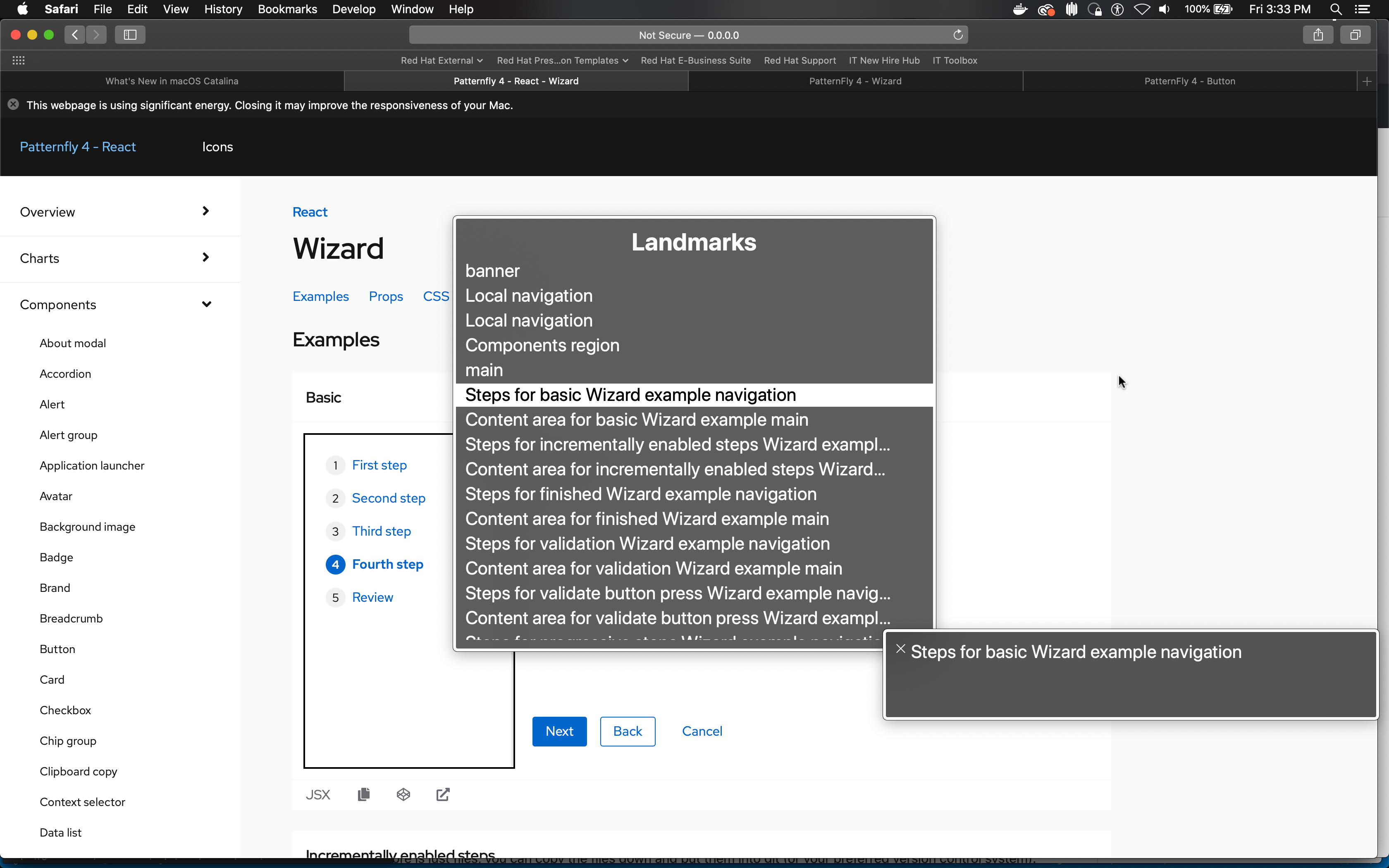
These updates are great to see! Thanks for working on this. I just had some comments on the use of aria-label for landmark regions. I pasted below one of the screencaps shared in the description. The thing that jumps out at me here is the use of "Content area for ... main":
My general suggestion is to be very conservative about adding labels to our examples. The Navigation component is an example where we definitely want to include labels in our examples, because we vetted the labels with content strategy and design, and the strings we provide are the same for all instances of that component. But in a case like this, there is a potential risk that placeholder strings we provide in examples are never updated by the consumer. And when this happens, it has the opposite effect of what you're hoping to achieve, because an incorrect label could be very confusing to the user. In other words, if in this case the options are: 1) having a descriptive label is nice but not necessary, 2) having no label is fine, vs 3) having an incorrect label is potentially damaging to the user experience, then the safest option is to not include a label in our examples. Or alternatively, find a way to provide a descriptive label where you eliminate the possibility of it being incorrect... To do this, a possible alternative solution is to use For the navigation region, we definitely need a unique label, and I can see it being really helpful to include the wizard header text as part of that label. If this is something we want to include, then I would definitely suggest aria-labelledby instead of aria-label for the navigation region, for similar reasons that I mention above (i.e. that it's really risky to include placeholder text in examples that might get ignored by consumers after copying/pasting the examples). So in this case, aria-labelledby could reference the wizard heading, and be announced as "Basic Steps navigation". Just to clarify though, I'm not opposed to supporting the ability to provide an aria-label in these components, I'm primarily warning against doing this in examples.
|
|
Good stuff, thx for the feedback everyone! I'll make some updates and push the changes soon as they are ready. Keep you posted! |
 dlabrecq
left a comment
dlabrecq
left a comment
dlabrecq
left a comment
There was a problem hiding this comment.
Looking good. However, I'm concerned about omitting the feature from our examples. I probably wouldn't implement this in an app without seeing it in an example, first.
|
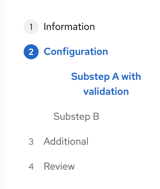
Alright, have another round of updates ready! Added some examples so both cases are clearer. I re-swizzled the way the labels are applied to use aria-labelledby approach, it's working quite well but I later realized a newer requirement for the in-page wizard not to have a header so for in-page wiz there's nothing to point aria-labelledby to out of the box. For these examples, I added the bare example title as aria-label to the We should now be able to override all these new props and I've done some cleanup to ensure we're not adding aria attributes in cases where none are needed. The reason the links were not showing up to screen reader users was because they didn't have href, so for these cases we now throw an error to help prevent users from making this mistake. I noticed the button in WizardToggle renders to the DOM for the in-page wizard, it's just hidden in the background.. is it used for anything? If not I may add a small check to remove it from the DOM for housekeeping sake. |
|
Thanks for making updates! I'm finally realizing that I don't remember the discussion or decision behind using "Steps" as the nav region label. It might be worth circling back to when that was introduced into core, as there might be some discussion there, or if not, follow up with content strategy on what's recommended here. For all the other nav regions, we had standardized on strings to use "Global", "Local", etc... so that users could expect a level of consistency in labeling across all the applications. I would think the same applies to the nav region in the wizard. |
jessiehuff
left a comment
jessiehuff
left a comment
There was a problem hiding this comment.
Great catch, Jenn!! And I agree that a conversation could be worthwhile on standardizing our labeling strategy. Also, small observation, I just noticed that the aria-label on the "Remember last step" example has a typo. 🙂
jessiehuff
left a comment
jessiehuff
left a comment
There was a problem hiding this comment.
This looks great to me personally. You've given a lot of options for customization, everything is accessible by keyboard and VO, and there's improvement to what displays in the rotor menu. Really great job on this! 🎉
seanforyou23
force-pushed
the
wiz-nav-discoverability
branch
from
0202d0f to
2ada447
Compare
jessiehuff
left a comment
jessiehuff
left a comment
There was a problem hiding this comment.
Looks like there's some conflicts now, but otherwise LGTM!
seanforyou23
force-pushed
the
wiz-nav-discoverability
branch
2 times, most recently
from
90a0d72 to
b68a736
Compare
|
|
jschuler
left a comment
jschuler
left a comment
There was a problem hiding this comment.
I guess we should wait for the core fix to go in first to align the button text
|
@seanforyou23 looks like the core fix went in for the alignment. Can we rebase this and hopefully merge it. |
seanforyou23
force-pushed
the
wiz-nav-discoverability
branch
2 times, most recently
from
cfa2fdf to
4797189
Compare
jschuler
left a comment
jschuler
left a comment
There was a problem hiding this comment.
small nit on the class modifier. Also, when I click on a nav item it has a border and looks a little heavy-handed, is this a known issue?
|
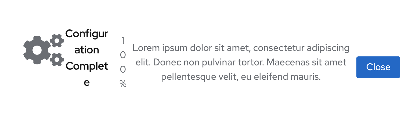
Also, not sure when it broke but looks like the Wizard finished step is not up-to-date anymore? |
|
@jschuler good catches, fixed up the emtpy state bits in the finished step example, I guess they've been out of date for a while now. Regarding the expanded class, I updated it to use dynamic style property from react-styles, but then noticed it's never applied because isOpen is always false. Does this need to be cleaned up? The last thing was that the docs build keep failing with different errors on CI vs locally. Local error attached below.. When I fix the path to something that works like
|
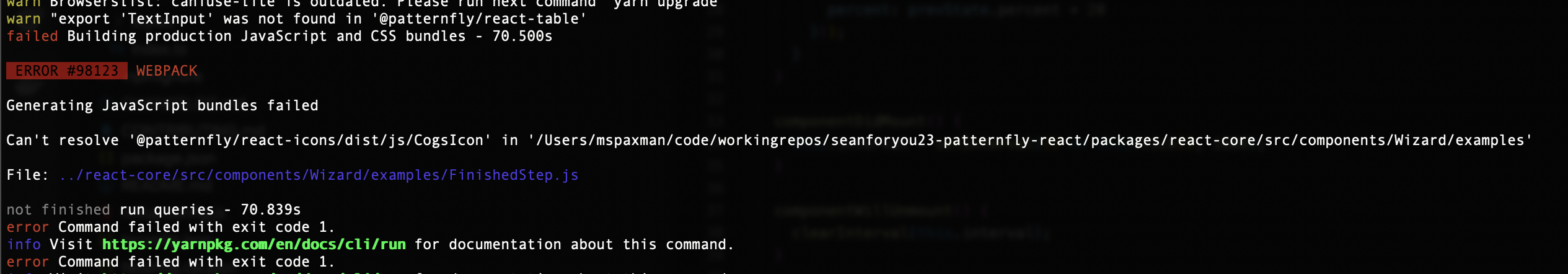
|
@seanforyou23 you should be able to set the path to |
[issue-1588] support both anchors and links in WizardNavItem
[issue-1588] default to div for main region, better examples
seanforyou23
force-pushed
the
wiz-nav-discoverability
branch
from
8eb8b88 to
c8be07f
Compare
|
Yea it doesn't seem to like that. The import works fine so I just ignored the eslint error for now if that's ok. |
|
Your changes have been released in:
Thanks for your contribution! 🎉 |
9 participants
What: Closes #1588
Updates Wiz to use more descriptive labels for landmark regions and to allow for buttons as well as anchors for the main nav items. Also adds jest/cypress tests.
It would be good to start considering these accessible names and the overall strategy of how to handle label composition as part of our ongoing content strategy (it's microcopy). I created a new issue tag
microcopy reviewto help identify where we need more people to weigh in on the approach in question. @abigaeljamie ping