-
Notifications
You must be signed in to change notification settings - Fork 13.5k
Highlight code on diagnostics when underlined #45776
New issue
Have a question about this project? Sign up for a free GitHub account to open an issue and contact its maintainers and the community.
By clicking “Sign up for GitHub”, you agree to our terms of service and privacy statement. We’ll occasionally send you account related emails.
Already on GitHub? Sign in to your account
Conversation
|
Well, I'm fine with the code changes. Not sure how to make the "policy" decision. |
|
I guess I'm not sure whether -- to my eyes -- this is a net win. I find the multiple colors version to be clearer, but also kind of "Christmas Tree". The bold version is less overwhelming in that respect, but still has a lot going on. |
|
I agree with the concerns about both changes. The other option is the one laid out in #42112 (comment) to instead attempt to support thin terminals by querying the current width, I feel that the full extent of the benefits of that would be quite a bit of work, but it could be done piece-meal by adding support for specific cases. For example, code longer than terminal width with no spans falling outside of terminal would be relatively simple to implement. Should I instead focus on trying to accomplish that? |
|
@nikomatsakis ping for your thoughts! maybe do a compiler team FCP? |
|
I suppose that is a possibility. @estebank do you have a preferred path at this point, from among the many options? |
|
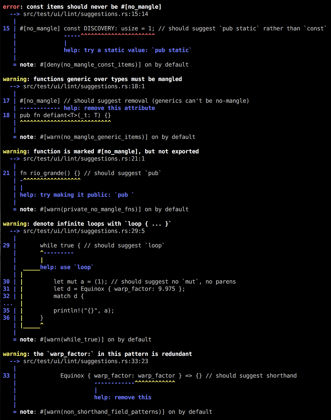
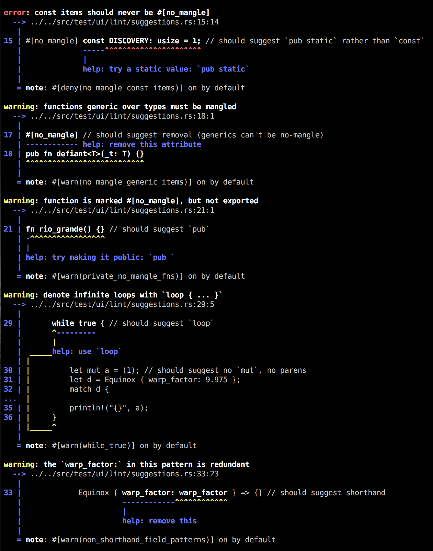
@nikomatsakis personally I'm partial to the 🎄 output as it is correct, but it is also ugly. Aesthetically I'd rather not add anything, but I'm deferring to the opinion of the community. Current output next to new output: |
|
I very much like the bolding here; it looks great! |
That is helpful to see it contrasted that way. |
|
As a user I really like the bold approach because it immediately draws the (beginner) eye to the problematic code and lets one digest the messages later. |
|
@estebank - one idea we had a long time ago when we started with the new format was to highlight with the colour of the underline. Not sure why we ended up going away from it, but figured it was worth a mention here. Thanks for doing the side by side comparison. Looks okay, though iirc, some people were a little sensitive the amount of bold we were using when we first rolled that out. Will see if anyone mentions that, since I think people are now used to the "new" error message format. |
|
@jonathandturner I also had #45752 as an alternative using the underline's colors. I'm considering providing some way to configure |
|
I'm not a fan of the bolding here. I'd just prefer the text to be white instead of white and bold. I'd like Rust keywords to be bold though. |
|
@Zoxc What about black-on-white console though |
|
@kennytm Then it should be black(er). The point is that it should be highlighted by a different shade of grey and not colors. |
|
I'd encourage people leaving comments here to weigh in on the thread on users -- that thread seemed to be leaning towards the multicolored variant. |
|
(However, I think ultimately @estebank is probably right that we should just make this configurable, but default to the "clearest" variant (most easily understood), which I suspect is the multicolored one.) |
|
Triage — I am going to close this PR to keep the queue clear. As #45752 seems to be more preferred, and even if it can be made configurable, it needs to be done on top of #45752 which certainly can't just reuse this PR as-is. Therefore I see no reason keeping this PR open. @estebank feel free to reopen if you disagree. |


Highlight the label's span by bolding the corresponding code:
Fix #42112.
r? @nikomatsakis (alternative to #45752 without coloring, only highlighting)