Skip to content
FlowingMedia edited this page Sep 14, 2010 · 2 revisions

CALENDAR

The calendar view is one of two temporal modes for visualizing data on TimeFlow (timeline being the other). The calendar provides three different modes for viewing data:
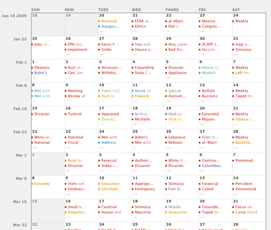
  • Daily: each row represents a week, starting on Sunday and ending on Saturday.
  • Monthly: each row represents a year, starting in January and ending in December
  • Yearly: each row represents a decade


  • Calendar Icons (and aggregation):
    There is a variety of icons that appear on the calendar view: solid, outline, and concentric circles. This diversity indicates different levels of data aggregation. The calendar aggregates data because, unlike the timeline view where users can zoom in indefinitely, this view has limited space per unit of time (day/month/year). So the icons reflect increasing levels of data compactness:

  • Solid circle: represents a single, positive data point.
  • Outlined circle: represents a single data point with negative value.
  • Concentric circles: represents the aggregation of multiple data points of the same type. For example, on the First 100 Days data set, there might have been five meetings at the White House and those get shown as a single set of concentric circles of the same color. The size of the concentric circles varies depending on the number of items being aggregated.
  • Pie chart: the icon that aggregates the most data. It represents a collection of concentric circles that would have been too long to display inside a day/month/year in the calendar view. The overall area of the pie chart refers to either the number of items being aggregated or to their numeric value (in case there are numeric values in the data). Each slice represents a value in the color dimension—for example, if I’m looking at the First 100 days data set by location, each slice in a pie chart would refer to a different location.
    Note: We cap the size of the pie chart so that it doesn’t spill over other cells in the calendar


    The calendar has different icons for different levels of data aggregation:
    - solid circle = single positive data value
    - outlined circle = single negative data value
    - concentric circles = multiple data points of the same type
    - pie cart = compilation of multiple sets of concentric circles


    Calendar Layout

  • Loose: shows days/months/years at a pre-set size, where the user counts on a vertical scroll bar to navigate the data
  • Compressed: compressed the size of days/month/years in an attempt to pack as much of the calendar in a single screen as possible
  • Clone this wiki locally