Fix: Font size picker max width on mobile #13264
Conversation
 jorgefilipecosta
added
[Type] Enhancement
jorgefilipecosta
added
[Type] Enhancement
There was a problem hiding this comment.
This is much better, thanks for taking care of it!
While you're in there, would you mind removing the 8px of left margin applied to the custom font size field? With the old method, this margin wasn't really noticeable, but with this approach it makes the spacing a little inconsistent:
Currently:

Without that 8px margin:
After that, this should be good to go. 👍
jorgefilipecosta
force-pushed
the
fix/font-size-picker-width-on-mobile
branch
from
3354e60
to
39e3284
Compare
|
Hi @kjellr thank you for the feedback, the margin was removed 👍 |
|
Instead of a max-width, would |
Hmm. That might be cleaner in the end, but we'd also have to provide margins to each of the items in there (they're currently all margin-less, except for the
Because of that, I don't think switching to flex-start here would make a big difference right now. Ideally that field would be of variable length, and the size/reset fields would knock down onto a second line if needed. Fixing all those would probably be helpful, and could be handled here if @jorgefilipecosta is up for it. But think it's fine if we tackle them in another PR. Even if we get to that later, this fixes a visual issue in the meantime. |

|
@kjellr That's a fair point, I didn't realise we were applying a max-width there. I definitely see some opportunities to improve the entire font size experience so it seems like this is a good start that can be iterated later. |
|
Thank you for the discussions and sharing your thoughts around this @chrisvanpatten and @kjellr. I merged this, for now, I will try to iterate and improve the experience taking the points referred. |
…rnmobile/372-use-RichText-on-Title-block

* 'master' of https://github.com/WordPress/gutenberg: (22 commits)
  Make the modal title styling consistent (#13669)
  Disable navigation block for text mode. (#12185)
  Fix: Linting problem in modal example code (#13671)
  Add myself as a code owner to the annotations (#13672)
  Add more reviewers to CODEOWNERS.md file (#13667)
  Plugin: Remove jQuery heartbeat-to-hooks proxying (#13576)
  Workflow: Add repository CODEOWNERS file (#13604)
  Add a mobile minimum size for form fields (#13639)
  Update edit-save documentation  (#13578)
  Alt image setting (#13631)
  Fix: Allow years lower than 1970 in DateTime component. (#13602)
  Using addQueryArgs to generate Manage All Reusable Blocks link (#13653)
  Bump plugin version to 5.0.0-rc.1 (#13652)
  Update lodash to 4.17.10 (#13651)
  Refreshed PR (#9469)
  Set default values of the width and height input fields according to the actual image dimensions (#7687)
  12647 fix css color picker (#12747)
  Remove "we" from messages (#13644)
  Fix: Font size picker max width on mobile (#13264)
  Fix/issue 12501 menu item aria label
  ...
## Description The font size picker used `justify-content: space-between;` to render the items on the screen. On small screens the sidebar may be 750px wide and I think the display results on this screen were suboptimal. This PR adds a max with to make sure the font size picker looks the same on mobile and desktop. ## How has this been tested? I checked that the font size picker renders as shown in the screenshots ## Screenshots <!-- if applicable --> Before: 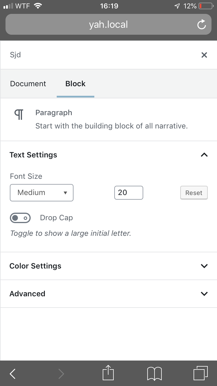 <img width="778" alt="screenshot 2019-01-09 at 16 23 46" src="https://user-images.githubusercontent.com/11271197/50912840-fc902d80-142a-11e9-8ad6-58285050d80d.png"> After:  <img width="775" alt="screenshot 2019-01-09 at 16 16 09" src="https://user-images.githubusercontent.com/11271197/50912879-129dee00-142b-11e9-8a72-bd4b4d996a7a.png">
## Description The font size picker used `justify-content: space-between;` to render the items on the screen. On small screens the sidebar may be 750px wide and I think the display results on this screen were suboptimal. This PR adds a max with to make sure the font size picker looks the same on mobile and desktop. ## How has this been tested? I checked that the font size picker renders as shown in the screenshots ## Screenshots <!-- if applicable --> Before:  <img width="778" alt="screenshot 2019-01-09 at 16 23 46" src="https://user-images.githubusercontent.com/11271197/50912840-fc902d80-142a-11e9-8ad6-58285050d80d.png"> After:  <img width="775" alt="screenshot 2019-01-09 at 16 16 09" src="https://user-images.githubusercontent.com/11271197/50912879-129dee00-142b-11e9-8a72-bd4b4d996a7a.png">
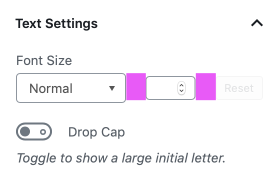
Description
The font size picker used
justify-content: space-between;to render the items on the screen. On small screens the sidebar may be 750px wide and I think the display results on this screen were suboptimal.This PR adds a max with to make sure the font size picker looks the same on mobile and desktop.
How has this been tested?
I checked that the font size picker renders as shown in the screenshots
Screenshots
Before:


After:

