Data Visualization
Data visualizations help look at the data in a form that's easier to understand. After all, it's much easier to process thousands of data points visually as opposed to written in a spreadsheet. A visualization can aid in understanding the underlying structure of a dataset, explore the relationships among variables, identify patterns, the list goes on...
Not only are visualizations used during EDA to explore and understand the data, but also continuously throughout the data analysis process. At the end, they're also a nice way to convey results and concepts.
Please note that Python has many visualization libraries that aren’t explained here. Some of which are:
- Bokeh: Interactive, web-ready plots that can be output as JSON objects, HTML documents, or interactive web applications.
- Plotly: Open-source graphing library for web-based data visualizations (built on top of the Plotly JavaScript library).
- ggplot: Based on R's ggplot2.
- Geoplotlib: Useful for visualizing geographical data and making maps.
For the Pandas, Seaborn, and Matplotlib sections of this tutorial, a basic understanding of working in Python is needed.
It is possible to do data analysis without python, and sometimes you will want to use python scripts for gathering data but another option for visualizing it.
- Looker (formerly Google Data Studio). This Full GDS tutorial compilation is a good crash course
Pandas is the workhorse of Python data analysis. Its dataframe data structure makes available a huge variety of tools. In addition, Pandas is supported by a great variety of packages in Python for specialized data analysis and machine learning, including data visualizations. Pandas itself is also capable of creating basic plots. One advantage of using Pandas for visualizations is chaining data analysis functions and plotting functions.
- Official Pandas Visualization: Up to date tutorial demonstration of visualizations using Pandas.
- Guide on Data Visualization with Pandas: Walkthrough of a Pandas data visualization using a Kaggle dataset, with code and plot images as well as explanations of the graphs.
- Daniel Chen Pandas Tutorial: Good in-depth video walkthrough showing a full data analysis with explanations.
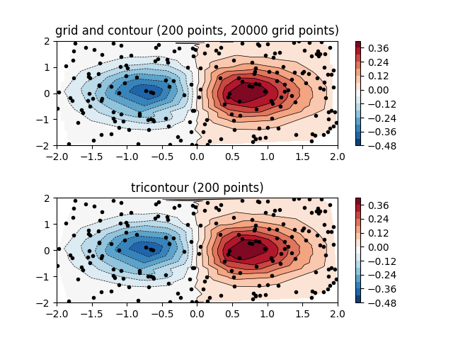
[Matplotlib] (https://matplotlib.org/) is a common visualization library used in Python for static, animated, and interactive visualizations. The library is built upon the structures of Pandas and NumPy, and it’s highly customizable. The pyplot module of Matplotlib resembles MATLAB plotting commands, so MATLAB users can find this library easier to use.
- Official Matplotlib Tutorial: Contains best practices and tutorials covering basic to more advanced Matplotlib visualizations.
- J.R. Johansson’s Matplotlib Guide: IPython notebook detailing some of the capabilities of Matplotlib’s 2D and 3D visualizations, along with code.
- Corey Schafer Matplotlib Tutorials: Beginner friendly video tutorials on some Matplotlib plotting.
- [Derek Banas Matplotlib Video Tutorial]: Video showing how to work with Matplotlib, from simple plotting to more advanced ones like 3D plotting, timeseries, etc.
Seaborn is another powerful Python visualization library that's built on top of Matplotlib. It extends the library to create more attractive graphics, mostly used for statistical plotting. Seaborn uses fewer syntax and provides many default themes for its visualizations.
- Official User Guide and Seaborn Tutorial: Well maintained tutorial focused on exploring the capabilities of Seaborn.
- Elite Data Science Tutorial on Seaborn: Tutorial guide with sample code and dataset, including images of the visualizations, with a general overview on what graph visualizations are useful for which purposes.
- Derek Banas Seaborn Video Tutorial: Recent video tutorial showing Seaborn’s different capabilities.
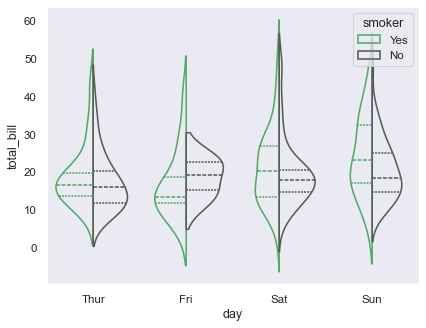
Tableau is a separate data visualization software tool/platform that makes it easy for anyone to organize data and create interactive visualizations. Programming is not required since Tableau offers drag-and-drop functionalities to build their charts and dashboards. However, users can still use Python and R to enhance the visualizations and build models.
Tableau offers different products, from data prep and management to creating and sharing data visualizations. It's mainly used for businesses in business intelligence and analytics, but there are free versions that individuals can experiment with. Students can get a free 1-year license using their .edu email following this link, or download the public version here. Tableau also offers different tutorials and resources.
- Official Tableau: Official resources provided by Tableau, including free training videos on how to use Tableau, articles on general data visualization best practices, and examples of dashboards created using Tableau.

(Some of these issues may be closed or open/in progress.)
- Stephanie Cho
- Willa Mannering