Skip to content
New issue

Have a question about this project? Sign up for a free GitHub account to open an issue and contact its maintainers and the community.

By clicking “Sign up for GitHub”, you agree to our terms of service and privacy statement. We’ll occasionally send you account related emails.

Already on GitHub? Sign in to your account

Debug icon consistensy pass #45158

Merged
merged 2 commits into from
Mar 7, 2018
Merged

Debug icon consistensy pass #45158

merged 2 commits into from
Mar 7, 2018

Conversation

chryw
Copy link
Contributor

@chryw chryw commented Mar 6, 2018

@isidorn
For these issues:
#44550
#44849
#45128

  • All icon files were touched. Some will look the same but the svg code is slightly different because I exported them together with the same config.
  • There are a few new files for log breakpoint and conditional breakpoint.
  • Before some icons have halo and foreground (VSIDE icon borrowed directly). New icons don't show halo.

image

@isidorn isidorn self-assigned this Mar 7, 2018
@isidorn isidorn added this to the March 2018 milestone Mar 7, 2018
@isidorn
Copy link
Contributor

isidorn commented Mar 7, 2018

@chryw thanks for this awesome PR!
There appears to be a conflict for the continue.svg. Can you please resolve that conflict by taking your new version of that file and ignore what is on master? I can also do this if you are having issues.

Did you build vscode out of source and check if icons seem to fit in light and dark theme? I can also do this.

As for the build errors feel free to ignore those.

@chryw
Copy link
Contributor Author

chryw commented Mar 7, 2018

@isidorn
I resolved that conflict.

No I didn't build. I only sparse-checkouted that one folder and aligned the icon files. I've been using the same light/dark theme color map for all icons that I've made for vscode. I agree it's a good idea to actually look at these icons in UI. I haven't set up my computer to build vscode yet. Could you help me do a visual pass on your computer if it's convenient?

@isidorn
Copy link
Contributor

isidorn commented Mar 7, 2018

@chryw thanks for resolving the conflict. I will merge this in and verify all is good by building vscode.
Just for the future here are nice steps on how to build vscode on your machine https://github.com/Microsoft/vscode/wiki/How-to-Contribute#build-and-run

@isidorn
Copy link
Contributor

isidorn commented Mar 7, 2018

Thanks again for polishing all our icons, really appreciate your work 🍹

@isidorn isidorn merged commit 4ea8fa2 into microsoft:master Mar 7, 2018
@chryw
Copy link
Contributor Author

chryw commented Mar 7, 2018

@isidorn Thanks! I'll set up my machine so I can help with more icon issues :-)

@isidorn
Copy link
Contributor

isidorn commented Mar 7, 2018

@chryw ok I will just comment here what I think does not work with the new icons:

  • drag.svg - it is too small compared to the other debug toolbar icons
    screen shot 2018-03-07 at 21 39 45

  • breakpoint red is too bright in dark theme and is drawing too much attention, particularly visible on conditional breakpoints
    screen shot 2018-03-07 at 21 37 48

  • there are no current arrow both for light and dark theme (it is supposed to be on the top stack frame in the editor glyph margin when you start debugging). So all "current something .svg" seem to be broken

  • there is no focussed arrow both for light and dark theme. So all "stack frame something.svg" seem to be broken

@isidorn
Copy link
Contributor

isidorn commented Mar 7, 2018

  • Now that we have changed the settings wrench in debug should we also change the one on the bottom of the activity bar to be consistent?
    screen shot 2018-03-07 at 21 45 28

  • The debug bug is huge in the activity bar and I am afraid it will bite me
    screen shot 2018-03-07 at 21 44 57

@isidorn
Copy link
Contributor

isidorn commented Mar 7, 2018

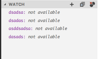
I like the new sexy remove breakpoint icon however I am not sure if we should use this icon also for the remove all watch expressions. Since the circles represent breakpoints for me. Though this is up for debate
screen shot 2018-03-07 at 21 48 35

Everything else seems to be good. Great work

@isidorn
Copy link
Contributor

isidorn commented Mar 7, 2018

Also let me know if you do not have time to fix these today and I will temporarly revert your commit so we do not get a bunch of bugs tomorrow from insider users.

@chryw chryw deleted the chryw/debug-icon-consistency branch March 7, 2018 21:36
@isidorn
Copy link
Contributor

isidorn commented Mar 7, 2018

Since i am going to bed I will temporarly revert the commit on master until we address the issues I mentioned above. Thanks

@chryw
Copy link
Contributor Author

chryw commented Mar 7, 2018

@isidorn I'm fixing these today:

  • drag icons size: I plan to change the css: width: 16px, height: 16px;
  • bright red color in dark theme: I plan to have dark theme point to the same svg file as light theme: breakpoint.svg (and more). Let's not introduce another red color to icon palette just for these.
  • add stack frame arrow icons
  • debug icon size in activity bar: I plan to add css: -webkit-mask-size: 28px;. svg icons should be responsive and not have size hard-coded. What do you think?

The "remove-all.svg" was meant to be used just for removing breakpoints. For clearing watch expressions, there is "clear-repl.svg" icon. Did you mean we should use that one?

@chryw
Copy link
Contributor Author

chryw commented Mar 7, 2018

@isidorn np. I'll send another PR tomorrow. Thanks! :-)

@isidorn
Copy link
Contributor

isidorn commented Mar 7, 2018

@chryw great! All your points make sense, feel free to hack around in .css
As for the remove-all for the watch. I think I would prefer sticking with our previous icon. Especially since it is consistent with the colapse all icon which is next to it

screen shot 2018-03-07 at 22 53 30

@chryw
Copy link
Contributor Author

chryw commented Mar 7, 2018

Got it. I'll grab a multi-box clear icon then.

@github-actions github-actions bot locked and limited conversation to collaborators Mar 27, 2020
Sign up for free to subscribe to this conversation on GitHub. Already have an account? Sign in.
Labels
None yet
Projects
None yet
Development

Successfully merging this pull request may close these issues.

2 participants