Console polish #1379
Console polish #1379
Conversation
- More consistency, previously the widths changed
- The button now fills the entire cell and doesn't rely on the negative padding and margin hack
- Vertically centered
- Remove defunct wrapper
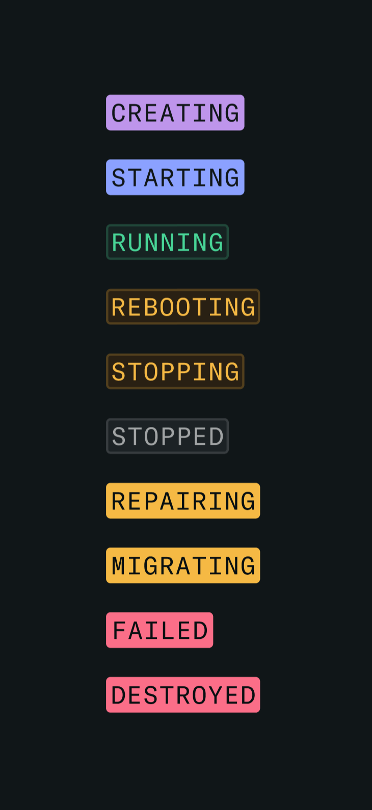
- Update to latest designs (Fixes #1332) - Remove ghost variant, is defunct - Rename component to better reflect usage (non-solid version is default) - Add extra theme colours and apply to `StatusBadge.tsx`
|
The latest updates on your projects. Learn more about Vercel for Git ↗︎
|
|
On status badge colours, I tried to use the dim badge at the default and the solid version when it'd be useful to draw attention to the status of something. Will be interesting to test out in practice. For example runnning is a normal idle state, but repairing is a significant action so we might want to highlight that. I'm also happy to be convinced otherwise in the name of consistency.
|
libs/ui/lib/badge/Badge.tsx
Outdated
|
|
||
| const defaultStyles = 'ring-1 ring-inset' | ||
|
|
||
| export const badgeColors: Record<BadgeVariant, Partial<Record<BadgeColor, string>>> = { |
There was a problem hiding this comment.
now that we're defining styles for every color, we can remove the Partial here
There was a problem hiding this comment.
And then you can remove the invariant check because every combination is guaranteed to be valid
| {/* TODO: This name should not suck; future us, make it so! */} | ||
| {/* stopPropagation prevents clicks from toggling row select in a single select table */} | ||
| <MenuButton | ||
| className="flex h-full w-10 items-center justify-center" |
There was a problem hiding this comment.
This is to make the whole cell clickable, right? Nice.
There was a problem hiding this comment.
Yep, was previously padded out with a large clickable area but it wasn't edge-to-edge.
| <span className="ml-1 inline-block text-accent-secondary">GiB</span> | ||
| </> | ||
| )} | ||
| </MiniTable.Cell> |
There was a problem hiding this comment.
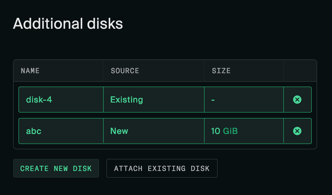
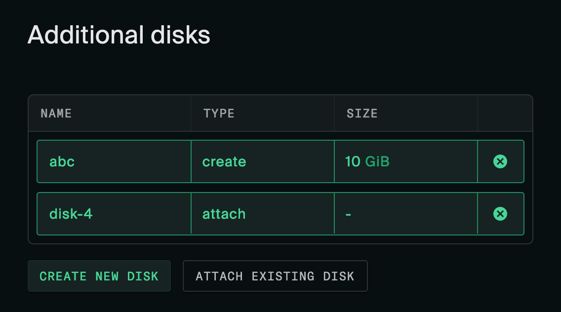
I like the size column, don't really like Source: New, though I admit Type: Attach/Create is definitely weird. How about Type: Existing/New? There's not a good word for this. Maybe there's some more subtle way of indicating existing vs. new, like a column giving some other attribute of the disk that indicates concretely that it exists. Like a created at column showing the create time but obviously only the existing disks have one.
I still find the green active styling with nested outlines kind of busy.
There was a problem hiding this comment.
I think language consistency here is important. When working with disks across different product interfaces the InstanceDiskAttachment language of attach/create should be a consistent touch point. We don't want to use different language here than we would in the docs, API, CLI, etc. I would keep the Type: Attach/Create nomenclature but potentially add a tooltip on the header if further clarification were needed.
There was a problem hiding this comment.
Yeah, I do find that convincing. When in doubt, stick close to the API and don't dress it up.
There was a problem hiding this comment.
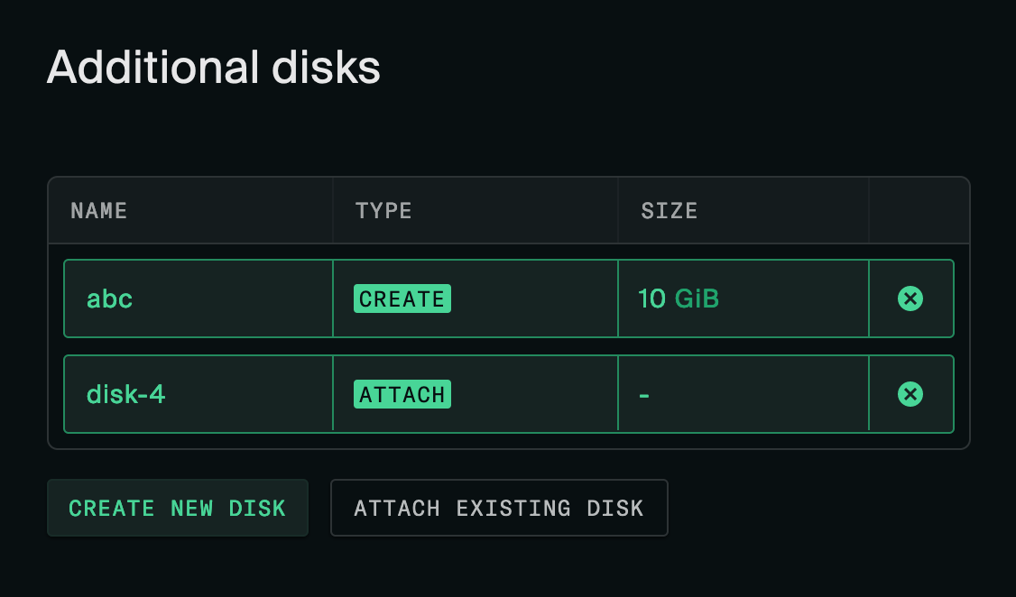
I changed it back to create/attach but I put it in a badge because it looked weird:
Before
After
libs/table/columns/action-col.tsx
Outdated
| meta: { thClassName: 'w-12 action-col', tdClassName: 'action-col' }, | ||
| meta: { | ||
| thClassName: 'action-col', | ||
| tdClassName: 'action-col children:p-0 w-[0.1%]', |
There was a problem hiding this comment.
This seems to work just as well with w-0. However since we know the cell is w-10, any problem with using that?
There was a problem hiding this comment.
Happy to use either. For whatever reason it felt like if I chose the small value and let the table constrain the width I'd only have to define the width once, and therefore only change it in one place if it was changed later.
There was a problem hiding this comment.
Yeah, that's a good point. In that case I think I like w-0 + a comment.
 david-crespo
left a comment
david-crespo
left a comment
david-crespo
left a comment
There was a problem hiding this comment.
Pending bikeshedding on the disks table, this is great.
|
We can figure out the disk stuff later. |
|
Cool — I'll revisit that later. Thanks for mergin' |
Knocking a few polish issues down.
This fixes:
Fixes #1326
Fixes #1287
Fixes #1082
Fixes #1078
Fixes #1332
Fixes #1079
Fixes #1077