Customizing the widget
This page presents the core of this library in terms of how to customize your widget.
Please take note that a PieWidget would only be concerned by the things discussed in the appearance section and the hit through inner-radius flag: everything else exclusively relates to a PieMenu widget.
- Infographic
- Appearance
-
Pie Menu Behavior
- Flags
-
Listeners
- Default Click Listener (for user interaction)
- Change Listener (for selection callback)
- Additional callbacks
- Indices
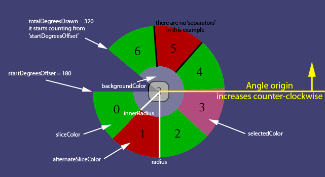
An (ugly) image that can be used as a reference for understanding more quickly what some variables relate to on a widget.
Anything that changes the way the widget is visually represented to the user appears in this section.
The main attributes are set within the constructors of your widget. Setters are also available so that you can modify those values whenever you want. They are attributes of the RadialGroup class and determine the spatial properties of the widget such as how big it is and how many degrees it spans.
The order of the variables in the following table is the order used by the constructors of this library.
| Variable's name | Type | Comment | Description |
|---|---|---|---|
| preferredRadius | float | Required. | Must be bigger than 1. The radius that defines the preferred size of the widget (under certain conditions it could adopt another size). |
| innerRadiusPercent | float | Optional. |
Defaults at 0. If provided, the sliceColor will only fill the region defined between the radius and its percentage value coming from this. For example, having a preferredRadius of 80 and an innerRadiusPercent of 0.5 will mean that the inner-radius will stand at 40 pixels from the center of the widget. A hole will be left into the middle of the widget, like a doughnut, and if a background or a backgroundColor was provided, it will be visible in the middle. Actors inserted into the widget are by default placed in the middle between the inner-radius and the radius. |
| startDegreesOffset | float | Optional. |
Defaults at 0. Considers that angles start at 0 along the x-axis and increment up to 360 in a counter-clockwise fashion. Defines how far from that origin the totalDegreesDrawn will be drawn. For example, if startDegreesOffset = 90 and totalDegreesDrawn = 180, you would obtain the left half of a circle. All the children would be spread within that half-circle evenly. |
| totalDegreesDrawn | float | Optional. |
Defaults at 360. Determines the total amount of degrees into which the contained Actors will be spread. For example, if startDegreesOffset = 0 and totalDegreesDrawn = 180, you would obtain the top half of a circle. |
Thus, the widget presented in the infographic section would be instantiated with the following constructor:
PieMenu myPieMenu = new PieMenu(whitePixel, 130, 50f/130, 180, 320); The Style is used to set up a "Skin" or "Theme" for your widget. The different attributes will be presented via their variable's name within the class that implements them.
If you ever want to change those variables after you have instantiated your widget, make sure to apply the changes by calling myWidget.setStyle(). Here is an example:
myWidget.getStyle().separatorWidth += 1;
myWidget.setStyle(myWidget.getStyle());The PieWidgetStyle contains most of the visual characteristics of the widgets this library enables you to manipulate.
| Variable's name | Type | Comment | Description |
|---|---|---|---|
| background | Drawable | Recommended. Optional. | A background that will be drawn behind everything else within the widget. Be mindful of the fact that this is unaffected by any of the other variables: it will be resized to fit in the whole region that represents the position, width and height of the widget. |
| backgroundColor | Color | Optional. | A background color that, if provided, will be drawn over the background image and below everything else. It mostly acts as a quick set up option if you do not have an image for you background. |
| sliceColor | Color | Recommended. Optional. | The color used to fill the "pie sectors" of each item. Consider using a fairly low alpha value if you are providing a background image. |
| alternateSliceColor | Color | Optional. | If this color is set, the "pie sectors" will alternate between the sliceColor and this one so that their defining region is more easily distinguished. |
| circumferenceColor | Color | Optional. |
Defaults to black. The color used for the line that defines the circumference of the widget. If the widget is not a complete a circle, this will only be applied along the partial circumference. If you have set a non-zero innerRadiusPercent value, this will also apply to the inner-radius of your widget. |
| circumferenceWidth | float | Optional. | Determines how wide the circumference line will be. |
| separatorColor | Color | Recommended. Optional. |
Defaults to black. The color used by the separating lines between each item. It is recommended mostly for the case where you are not defining an alternateSliceColor. |
| separatorWidth | float | Recommended. Optional. | Determines how wide the lines that separate each region will be. |
The PieMenuStyle extends the PieWidgetStyle: this means that everything that was described in the Pie Widget Style section also applies here.
| Variable's name | Type | Comment | Description |
|---|---|---|---|
| selectedColor | Color | Recommended. Optional. | Defines the color of the region which is currently selected. If you have no downColor set, this color will also be used for when the user is pressing down on a slice and hasn't released the press yet. |
| downColor | Color | Recommended. Optional. | Defines the color of the region which is currently highlighted (i.e. pressed). Highlights come from dragging the mouse over the PieMenu while pressing down a mouse-button. The mobile-equivalent is of having your finger pressing down on the PieMenu and dragging it around without releasing. If you are setting a selectedColor value, then you do not need to bother with this one unless you want those colors to be different. |
| hoverColor | Color | Recommended. Optional. | Defines the color of the region which is currently hovered by the mouse. Only works for the desktops. |
| hoverSelectedColor | Color | Recommended. Optional. | Defines the color of the region which is currently hovered by the mouse when this region was also a highlighted region. Both hoverColor and selectedColor must be defined for this attribute to be allowed to be set. |
Please note that, by default, if the highlightedIndex and the selectedIndex are the same, then the selectedColor is applied. If you don't know what those indices are, check out the indices section.
A few methods could be interesting to @Override during the instantiation of a widget:
| Method's signature | Default | Description | Comment |
|---|---|---|---|
float getActorDistanceFromCenter (Actor actor) |
(radius + innerRadius) / 2 | Determines how far from the center of the widget a child should be. | Do not position the Actor directly in this method: that is handled internally. Just return the desired distance from the center. |
void modifyActor (Actor actor, float degreesPerChild, float actorDistanceFromCenter) |
None | Used to apply changes to an Actor according to certain rules. | Can be useful to change the size of your images, for example, but do not forget to actually call setSize() on the Actor, else nothing will happen. Also, look into getEstimatedRadiusAt() to help you with this one. |
Color getColor (int index) |
Uses the Style to find which Color to use according to basic rules. |
Determines the color of the slice in which resides the Actor designated by the index parameter. |
Do not set the color of the ShapeDrawer in there: that is handled internally. Just return the desired Color. If you are using a Style, be careful with what you do in here because it will end up messing with it. |
void act (float delta) |
None | This is called automatically every time stage.act() is called in the render() method of your game (those are libGDX terms). |
It is the perfect place to define a custom animation or any type of evolution through time. |
If you aren't familiar with the concept of anonymous class, just look at this example to get a better feel of how it's done:
float time;
final float BASE_RADIUS = 180;

PieWidget myRad = new PieWidget(whitePixel, style, BASE_RADIUS) {

    @Override
    public float getActorDistanceFromCenter(Actor actor) {

        /* We want the Actors to be placed closer to the edge than the default value. */
        return getAmountOfChildren() > 1
                ? getMaxRadius() - getChild(0).getWidth()
                : 0;
    }

    @Override
    public void act(float delta) {
        super.act(delta);

        /* A custom animation! */
        time += delta*5;
        myRad.setStartDegreesOffset((time * 10) % 360);
        myRad.setMinRadius(MathUtils.sin(time) * 20 + BASE_RADIUS);
        myRad.centerOnScreen();
    }

    @Override
    public void modifyActor(Actor actor, float degreesPerChild, float actorDistanceFromCenter) {

        /* Images will appear at their full-size: you most probably want to change that! */
        if(actor instanceof Image) {
            float size = getEstimatedRadiusAt(degreesPerChild, actorDistanceFromCenter);
            size *= 1.26f; // adjusting the returned value to our likes
            actor.setSize(size, size);
        }
    }

    @Override
    public Color getColor(int index) {
        Color fader = super.getColor(index);

        /* Let's add some fading alpha-gradient! */
        return new Color(fader.r, fader.g, fader.b, fader.a/index);
    }
};
Keep in mind that you do not need to override any of those: they are only there for your own convenience and creativity's sake.
The PieMenu is a wonderful beast which acts as a wrapper around the PieWidget's (and thus RadialGroup's) basic functionalities: it provides the programmer with an easy way to interact with the widget. This section will talk about how you can customize the behavior of your PieMenu.
Flags influence the behavior of the widget in major ways. Use the provided setters to play with them.
If you decide not to use the (default) PieMenuClickListener, be aware that the Selection button behavior will have to be reintroduced (it's very easy: just take a look at the code of the default listener).
| Flag | Default value | Setter | Comment |
|---|---|---|---|
| Hit through inner-radius | true | setHitThroughInnerRadius |
The only flag which also applies to a PieWidget. |
| Infinite selection range | false | setInfiniteSelectionRange |
Extend the selection beyond the pies. |
| Middle cancel | false | setMiddleCancel |
Only applies when infinite selection range is set. |
| Default index | PieMenu.NO_SELECTION | setDefaultIndex |
Any negative value is equivalent to PieMenu.NO_SELECTION. |
| Selection button | Input.Buttons.LEFT | setSelectionButton |
Change which mouse-button is used to interact with the PieMenu. |
| Pie Menu Listener | PieMenuClickListener | setPieMenuListener |
For the experts and control freaks! |
To summarize: the default values make it so that the user will only be able to interact with a standard PieMenu using a left-click button of the mouse (or a simple touch of the finger on a mobile phone) within the boundaries of the sectors defined by the radii. The middleCancel flag only applies when the infiniteRange is activated.
Determines whether or not a click event should propagate through an inner-radius (despite the presence or not of a backgroundColor, for example).
If you were placing a PieWidget around a Button, for example, and you didn't want the users to be able to click through the inner-radius and trigger the button's listener, you would want to set this flag to false.
Determines whether or not selection should only happen if the mouse is within the radii of the widget.
When set to false, the selection of an item will happen only when the user clicks and releases within the boundaries fixed by the radius and inner-radius variables.
Determines whether or not releasing a click within the inner-radius should cancel the selection.
If true, a click released in the middle will trigger a selection of the defaultIndex.
Only applies for the case where you have activated the infiniteSelectionRange flag.
The index that is used as a fallback value whenever a processed user-input does not map to a valid child index value.
This value can be negative (such as PieMenu.NO_SELECTION), if you want nothing to be the default (which is already the default behavior).
Using its setter (setDefaultIndex) will trigger the Listener associated with the selection-change, but only if the selectedIndex was not a valid index.
Determines which button must be used to interact with the widget. It is the mouse button required to be used to begin and end the interaction (from touchDown to touchUp).
It's recommended to use libGDX's Input.Buttons class to obtain the proper integer. Nonetheless, for your convenience, here is a table of the mapping:
| Mouse button | Integer |
|---|---|
| LEFT | 0 |
| RIGHT | 1 |
| MIDDLE | 2 |
| BACK | 3 |
| FORWARD | 4 |
Jump to the default click listener section to learn more.
Listeners are an integral part of what makes the PieMenu what it is: they define the sequence of operations to be executed based on user's interactions and inputs.
The PieMenuListener is added to the widget by default when it is instantiated. You are not obligated to use it, but it has been designed to work "as is", for the most part. If you ever want to change that, the following line should be used and takes care of removing the default listener and replacing it with your own:
myPieMenu.setPieMenuListener(new MyOwnAmazingInputListener());To see an example of how to do that, you might be interested in the Keyboard-Key-Mapping example.
In any case, here is the code of the PieMenuListener in all of its glory. Feel free to reuse any part of it within your own implementations:
public static class PieMenuListener extends ClickListener {

    private PieMenu pieMenu;

    /**
     * @return the {@link PieMenu} that contains this {@link PieMenuListener}.
     */
    public PieMenu getPieMenu() {
        return pieMenu;
    }

    public PieMenuListener(PieMenu pieMenu) {
        setTapSquareSize(Integer.MAX_VALUE);
        this.pieMenu = pieMenu;
    }

    @Override
    public boolean touchDown(InputEvent event, float x, float y, int pointer, int button) {
        if(event.getListenerActor() != pieMenu)
            return false;

        boolean accepted = (button == pieMenu.getSelectionButton());
        if(accepted)
            pieMenu.highlightChildRegionAtStage(event.getStageX(), event.getStageY());
        return accepted;
    }

    @Override
    public void touchDragged(InputEvent event, float x, float y, int pointer) {
        if(event.getListenerActor() != pieMenu)
            return;

        pieMenu.highlightChildRegionAtStage(event.getStageX(), event.getStageY());
        super.touchDragged(event, x, y, pointer);
    }

    @Override
    public void touchUp(InputEvent event, float x, float y, int pointer, int button) {
        if(event.getListenerActor() != pieMenu)
            return;

        if(button != pieMenu.getSelectionButton())
            return;
        pieMenu.selectChildRegionAtStage(event.getStageX(), event.getStageY());
        super.touchUp(event, x, y, pointer, button);
    }

    @Override
    public boolean mouseMoved(InputEvent event, float x, float y) {
        if(event.getListenerActor() != pieMenu)
            return false;

        pieMenu.hoverChildRegionAtStage(event.getStageX(), event.getStageY());
        return true;
    }

    @Override
    public void exit(InputEvent event, float x, float y, int pointer, Actor toActor) {
        if(event.getListenerActor() != pieMenu)
            return;

        /* Reset the hover only when the mouse exits the PieMenu. */
        if(toActor != pieMenu && (toActor == null || !(toActor.isDescendantOf(pieMenu))))
            pieMenu.hoverIndex(PieMenu.NO_SELECTION);
        super.exit(event, x, y, pointer, toActor);
    }
}This Listener is called whenever a new child is selected by the user, or when the selectIndex(int) method is used.
Here is how to implement it:
myPieMenu.addListener(new ChangeListener() {
    @Override
    public void changed(ChangeEvent event, Actor actor) {
        System.out.println("ChangeListener - newly selected index: " + myPieMenu.getSelectedIndex());
    }
});If callbacks executed on selection-changes weren't enough: it's your lucky day! This library offers you an extra Listener called the PieMenuCallbacks that includes two more callbacks to be used: one for highlight-changes, and the other one for hover-changes.
An interesting property of these two callbacks is that they will never both execute for the same action from the user: highlights and hovers are exclusive by nature of the way the default PieMenuListener implemented them.
Every time the currently highlighted item changes, this will be called. Highlights are only triggered by dragged-movements, that is: if you press, don't release, and move. There is however an exception: the initial click (touchDown, in the language of ClickListeners) also triggers a highlight in order to provide visual feedback to the user right away.
Here is how you can implement this Listener:
myPieMenu.addListener(new PieMenu.PieMenuCallbacks() {
    @Override
    public void onHighlightChange(int highlightedIndex) {
        System.out.println("Highlighted index: " + highlightedIndex);
    }
});Every time the currently hovered item changes, this will be called. Hovers are only triggered by mouse movements that do not involve any button being pressed. This also means that mobile users will never be able to trigger this callback.
Here is how you can implement this Listener:
myPieMenu.addListener(new PieMenu.PieMenuCallbacks() {
    @Override
    public void onHoverChange(int hoveredIndex) {
        System.out.println("Hovered index: " + hoveredIndex);
    }
});A PieMenu generally contains a few Actors. Those are positioned in a circular fashion around the center of the widget, and are assigned indices based on where they are relative to the startDegreesOffset.
Moving counter-clockwise, starting from the startDegreesOffset, the index of each child (i.e. an Actor whose parent is the widget) increments, starting from 0.
| Index name | Default value | Setter | Triggering-setter |
|---|---|---|---|
| selectedIndex | PieMenu.NO_SELECTION |
setSelectedIndex |
selectIndex |
| highlightedIndex | PieMenu.NO_SELECTION |
setHighlightedIndex |
highlightIndex |
| hoveredIndex | PieMenu.NO_SELECTION |
setHoveredIndex |
hoverIndex |
Using the Setters will not trigger any Listener: if your goal is to trigger them, use the Triggering-setters instead.
Be aware that the selection of an item is generally preceded by a highlight of that item (even if the user didn't drag).
Finally, two relevant methods should be discussed here, for your general convenience:
-
isValidIndex(int): Given an integer (presumably a child index), finds whether or not it would be a valid candidate to highlight or select. Another way to put it is that the given integer should be able to be used to query an existingActorwho is contained within the widget. -
mapIndex(int): Used to transform an index into a known range. It'll either remain itself if it was designating a valid child index, else it becomes thedefaultIndexvalue.