-
Notifications
You must be signed in to change notification settings - Fork 13
Examples
Each example described here starts with a title which is a link to an example code that implements it, followed by a textual description of its expected behavior. Finally, a GIF to demonstrate its functionality is provided.
If you came here because you were interested in finding out how to code the most representational member of the circular context menu family, you should go check out the click-drag example.
For a PieWidget example, check out the button-toggle example.
Those examples are mostly there for you to get an idea of what is possible, and so that you can easily set yourself up by copying some code. The actual customization of the behavior and look of your widget goes beyond what is demonstrated here and you are encouraged to explore the multiple possibilities provided: you should adapt the widget to your specific needs and requirements (see Customizing the widget for more details).
The Demonstration class basically has most of those examples included in a single file. It's the class used to generate the online demo.
- Custom-animated
- Permanent
- Click-toggle
- Click-drag
- Nested-menu
- Button-toggle
- Button-bound
- Keyboard-key-mapping
This menu's goal is to demonstrate how to stray away from the general formula and go ahead with a more customized animation. It has no inner-radius value and, instead, places its components closer to the edge by overriding the appropriate method.
It does not use infiniteRange and has no defaultIndex. It would probably look nice as a simple RadialGroup widget, but it's interesting to see just how well the PieMenu functionalities still work despite changing the style's values in real-time.

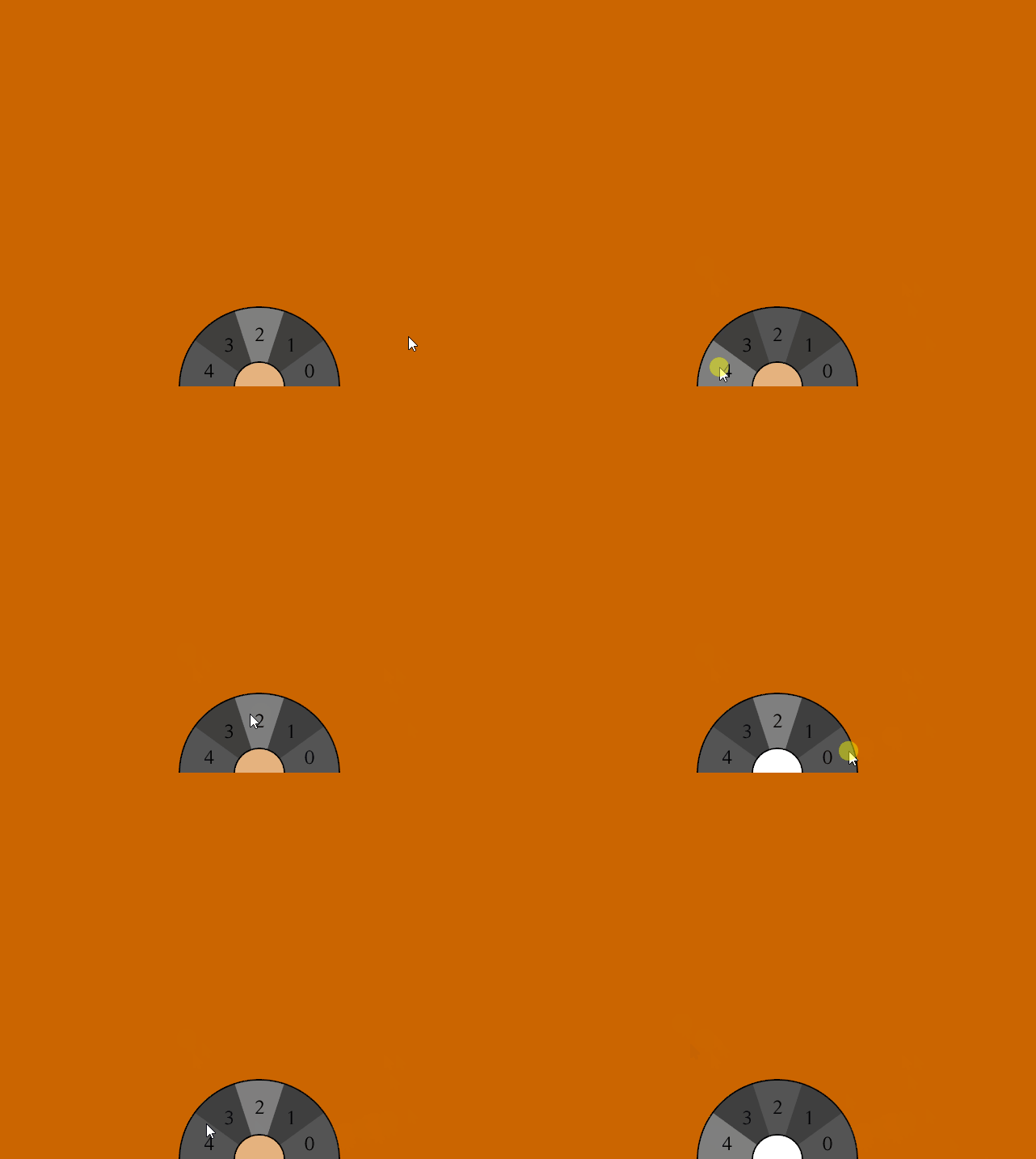
This menu remains displayed until you want it gone. It restricts the detection of interactions to the radius of the widget itself: clicking outside of it will not affect its state.
To get it to feel a bit more integrated in the window, only a half-circle is drawn at the edge of the screen, rather than floating in the middle of nowhere.
It has a default value for whenever the user's mouse position doesn't correspond to a valid selection. Also, if the user's mouse focus isn't on the widget, it will keep highlighting the currently selected item.

This menu will be displayed only when the user clicks the desired mouse-button (the middle-click, here). Once it is revealed, the user is free to select any option.
There are no restrictions applied to the range of detection of the input click of the user (left-click!): no matter how far the user clicks, the widget will deduct and select the desired item.
When the widget is revealed to the user, his last-selected item will not be highlighted.
This is the only widget which features images and drawables, but don't be fooled: all the widgets can do that.

This menu overrides the default selection button to be the right-click. It is also set to be displayed only when the user does a right-click. This specific setup gives us one of the most efficient context menu there is: the user presses the right-click, does not release it, and simply drags/moves the mouse in the direction of the desired item. It is the act of releasing the click which actually selects the item. This is a fundamental principal of how circular context menu may work.
There are no restrictions applied to the range of detection of the input click of the user (right-click!): no matter how far the user clicks, the widget will deduct and select the desired item.
The widget registered a HighlightChangeListener and thus allows immediate feedback to the user whenever the currently highlighted item is changed (and thus no actual selection is required for that to happen).
Whenever the widget appears on the screen, it will still show the last selected item as highlighted.

A menu which invokes another sub-menu after the first selection. It is based off the Click-drag menu. The first menu uses the right-click to summon and select, and then the second menu uses the left-left for the selection.
When the second menu is up, the first menu remains apparent, but is slightly faded. That second menu has the middleCancel flag set, along with a value for the innerRadius.

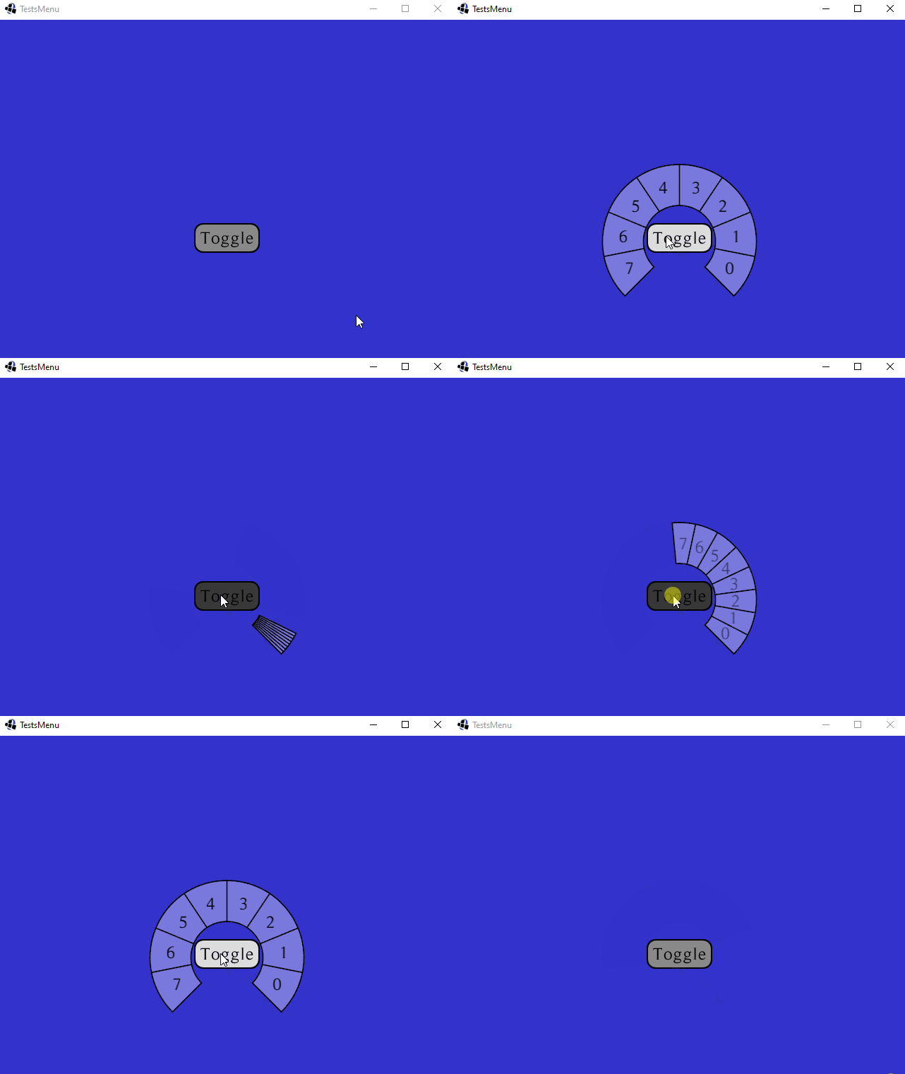
This is a simple PieWidget, and not a PieMenu. Its visibility is toggled by the pressing of a button.
PieWidgets are just like RadialGroups, except that they allow you to draw certain elements as well. They are nothing more than containers, and do not provide any other functionalities. If you feel confused, feel free to check out the wiki page that explains the difference between the 3 types of widgets this library offers.
This widget presents the Animated form of the PieWidget.

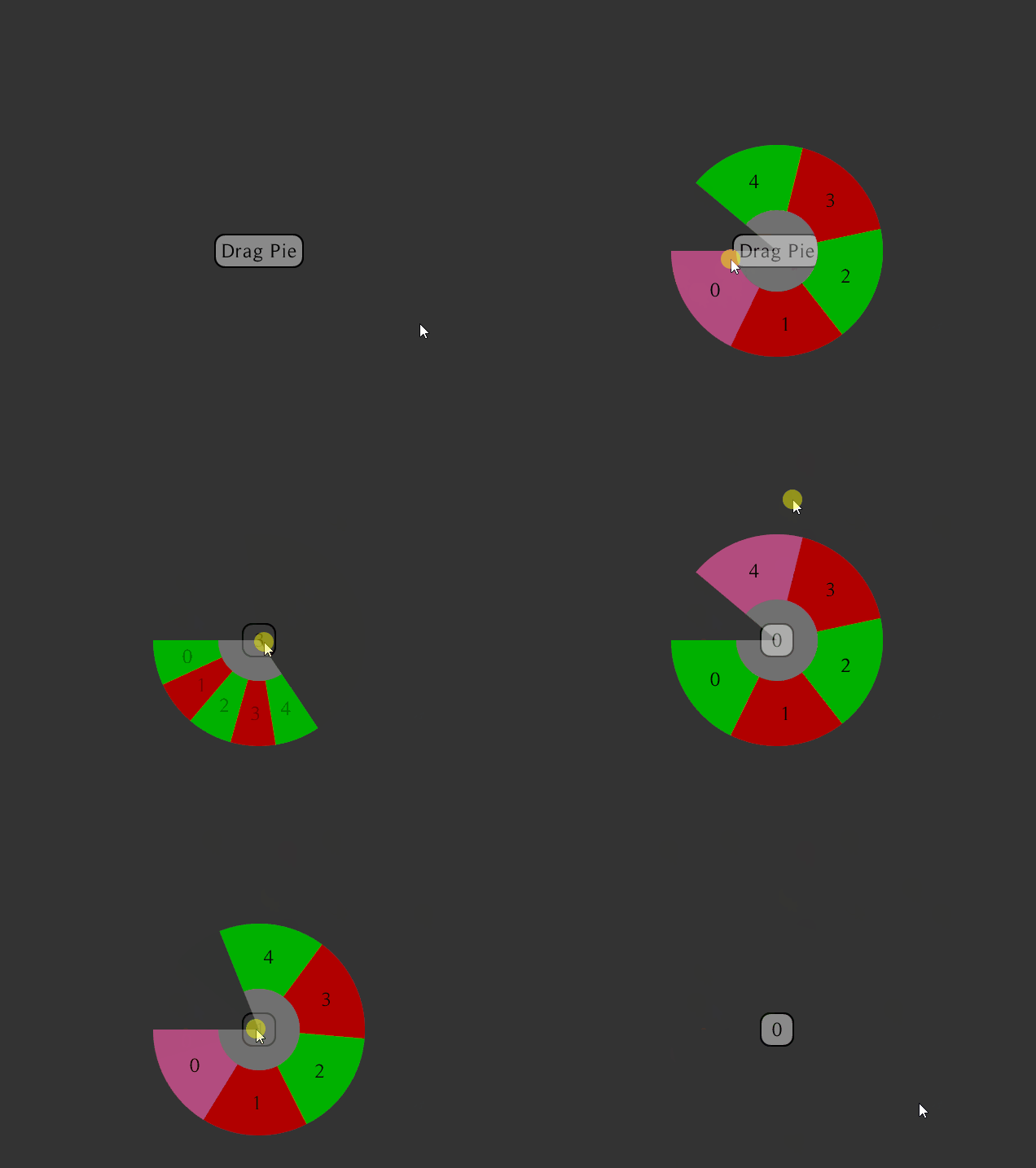
This menu is "attached" to a TextButton. As soon as the user clicks the button, he is presented with the Pie Menu and can quickly select a choice among the presented items. To do so, the user must not release its left-click, and simply drags/moves the mouse in the direction of the desired item. It is the act of releasing the click which actually selects the item. This is a fundamental principal of how circular context menu may work.
Upon release, the TextButton changes its text to reflect the user's selection.
When the user summons the widget again, it will not be highlighting his last-selected item.
This widget presents the Animated form of the PieMenu.

This menu overrides the default PieMenuListener in order to add the functionality that allows one to map a keyboard-key stroke to a selected index (in this case, the menu actually wraps the PieMenuListener with extra functionalities, rather than completely replacing it). The red numbers let the user know which number it can press-down with its keyboard to trigger the selection of the associated slice.
It uses many flags, namely: middleCancel, infiniteRange and defaultIndex. This makes it so that a click within the inner-radius will automatically select the default index. If no default index had been set, that click within the inner-radius would've simply been interpreted as a cancel, basically.
