-
Notifications
You must be signed in to change notification settings - Fork 55
Auto Exposure Lock Widget
Siddharth Utgikar edited this page Feb 26, 2021
·
3 revisions
(Updated widget in develop branch)
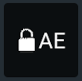
Auto Exposure Lock Widget will display the current status of Exposure Lock. Tapping on the widget will engage/disengage the exposure lock. The widget has two states
-
 Auto Exposure Unlocked - The exposure settings vary based on the lighting conditions in front of the camera
 -
 Auto Exposure Locked - The exposure settings will be maintained irrespective of the lighting conditions in front of the camera
<dji.ux.beta.cameracore.widget.autoexposurelock.AutoExposureLockWidget
        android:id="@+id/widget_auto_exposure_lock"
        android:layout_width="50dp"
android:layout_height="50dp"/>The widget can be customized by the user to serve their purpose and theme. The customizations can be done using attributes in XML or programmatically using the APIs.
<dji.ux.beta.cameracore.widget.autoexposurelock.AutoExposureLockWidget
        android:id="@+id/widget_auto_exposure_lock"
        android:layout_width="50dp"
        android:layout_height="50dp"
        android:background="@color/white"
        app:uxsdk_autoExposureLockDrawableTint="@color/green"
        app:uxsdk_autoExposureUnlockDrawableTint="@color/black"
        app:uxsdk_widgetTitleTextColor="@color/black" />

List of the customizable XML attributes
-
uxsdk_cameraIndex- The camera index to which the widget should react. -
uxsdk_lensType- Type of lens to which the widget should react. -
uxsdk_widgetTitleBackground- The background of the widget's text. -
uxsdk_widgetTitleTextAppearance- The appearance of the text in widget. -
uxsdk_widgetTitleTextSize- The size of the text in widget. -
uxsdk_disconnectedTextColor- The color of the text in widget when product is disconnected. -
uxsdk_autoExposureLockTextColor- The color of the text in widget when exposure is locked. -
uxsdk_autoExposureUnlockTextColor- The color of the text in widget when exposure is unlocked. -
uxsdk_disconnectedIconColor- The color of the icon when product is disconnected. -
uxsdk_autoExposureLockIconColor- The color tint when the exposure is locked. -
uxsdk_autoExposureUnlockIconColor- The drawable tint when the exposure is unlocked. -
uxsdk_autoExposureLockIcon- The icon to be shown when the exposure is locked. -
uxsdk_autoExposureUnlockIcon- The icon to be shown when the exposure is unlocked.
val autoExposureLockWidget: AutoExposureLockWidget = findViewById(R.id.widget_auto_exposure_lock)
autoExposureLockWidget.setBackgroundColor(Color.White)
autoExposureLockWidget.setTitleTextColor(Color.Black)
autoExposureLockWidget.setAutoExposureUnlockIconTint(Color.Black)
autoExposureLockWidget.setAutoExposureLockIconTint(Color.Green)AutoExposureLockWidget autoExposureLockWidget = findViewById(R.id.widget_auto_exposure_lock);
autoExposureLockWidget.setBackgroundColor(Color.White);
autoExposureLockWidget.setTitleTextColor(Color.Black);
autoExposureLockWidget.setAutoExposureUnlockIconTint(Color.Black);
autoExposureLockWidget.setAutoExposureLockIconTint(Color.Green);List of the customization APIs
-
var lensType: LensType- Type of lens to which the widget should react. -
var cameraIndex: CameraIndex- The camera index to which the widget should react. -
@get:ColorInt var disconnectedTextColor: Int- The color of the text when product is disconnected. -
@get:ColorInt var autoExposureLockedTextColor: Int- The color of the text when exposure is locked. -
@get:ColorInt var autoExposureUnlockedTextColor: Int- The color of the text when exposure is unlocked. -
var titleBackground: Drawable?- The background of the text. -
fun setTitleBackground(@DrawableRes resourceId: Int)- Set the background resource of the widget text. -
fun setTitleTextAppearance(@StyleRes textAppearance: Int)- Set the appearance of the widget text. -
@get:Dimension var titleTextSize: Float- The text size for the widget. -
var iconBackground: Drawable?- The background of the icon. -
fun setIconBackground(@DrawableRes resourceId: Int)- Set the background of the icon. -
var autoExposureLockIcon: Drawable- The icon for the widget when exposure is locked. -
fun setAutoExposureLockIcon(@DrawableRes resourceId: Int)- Set the resource of the icon when exposure is locked. -
var autoExposureUnlockIcon: Drawable- The icon for the widget when exposure is unlocked. -
fun setAutoExposureUnlockIcon(@DrawableRes resourceId: Int)- Set the resource of the icon when exposure is unlocked. -
@get:ColorInt var disconnectedStateIconColor- The color for the icon when product is disconnected. -
@get:ColorInt var autoExposureLockIconColor- The color for the icon when exposure is unlocked. -
@get:ColorInt var autoExposureUnlockIconColor- The color for the icon when exposure is unlocked.
The widget provides hooks for users to add functionality based on state changes in the widget. The Auto Exposure Lock widget provides two types of hooks
-
ModelState- Provides hooks in events received by the widget from the widget model.-
data class ProductConnected(val isConnected: Boolean) : ModelState()- Event when product is connected or disconnected. -
data class AutoExposureStateUpdated(val autoExposureLockState: AutoExposureLockState) : ModelState()- Event when auto exposure lock state is updated.
-
The user can subscribe to this using public override fun getWidgetStateUpdate(): Flowable<ModelState>.
-
UIState- Provides hooks in events related to user interaction with the widget.-
object WidgetClicked : UIState()- Event when widget is clicked.
-
The user can subscribe to this using fun getUIStateUpdates(): Flowable<UIState>.
DJI UX SDK Version 5 Beta 5
UX SDK 5.0 Overview
Core Module
Camera Core Module
Visual Cameras Module
- Camera Config