-
Notifications
You must be signed in to change notification settings - Fork 54
Take Off Widget
A button that performs actions related to takeoff and landing. There are three possible states for the widget: ready to take off, ready to land, and landing in progress. Clicking the button in the ready to take off state will open the takeoff confirmation dialog, and clicking the button in the ready to land state will open the landing confirmation dialog.
| Image | State | Description | Dialog shown when tapped |
|---|---|---|---|
 |
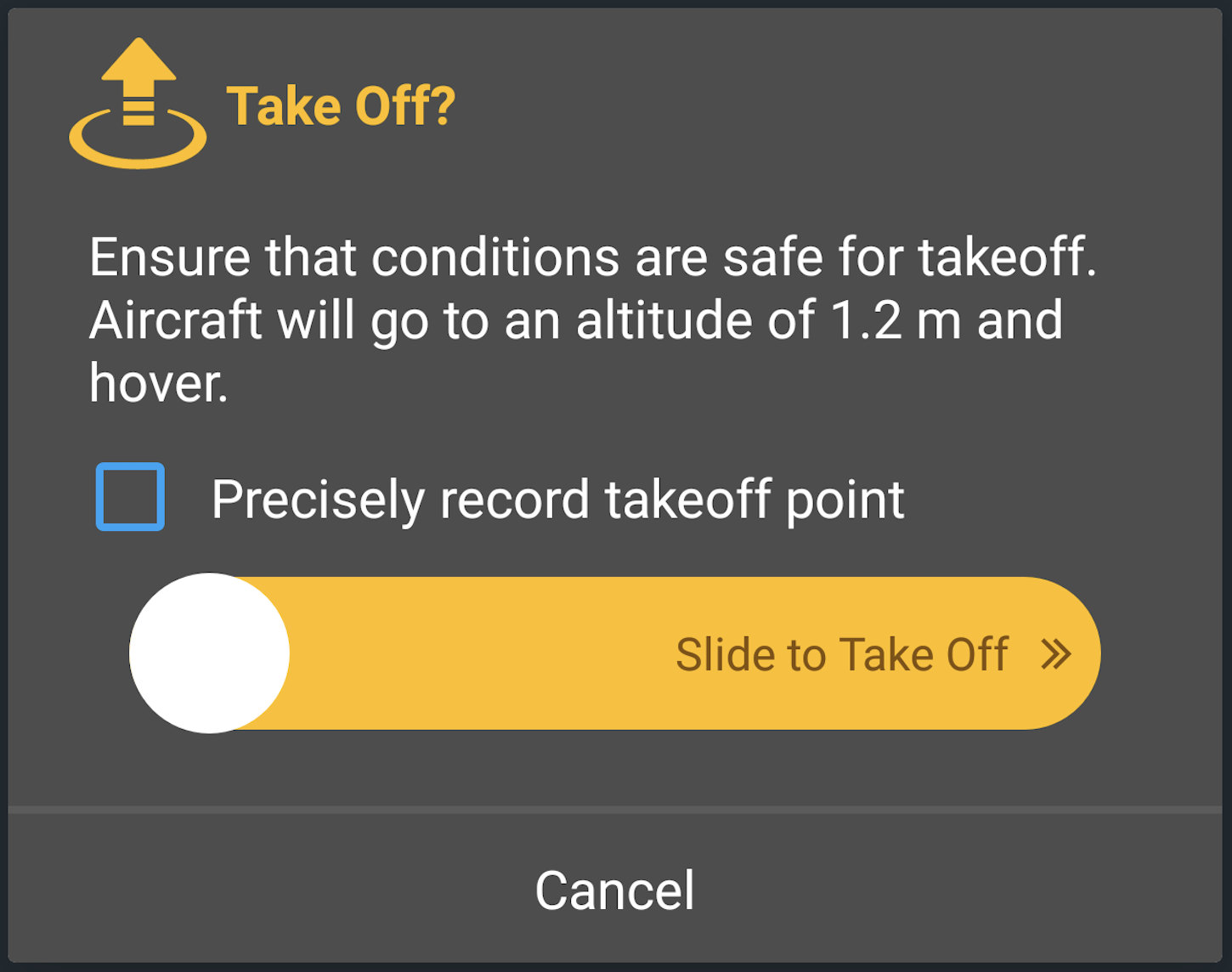
Ready to Take Off | The aircraft is not flying. Tapping will show a dialog to confirm takeoff |  |
 |
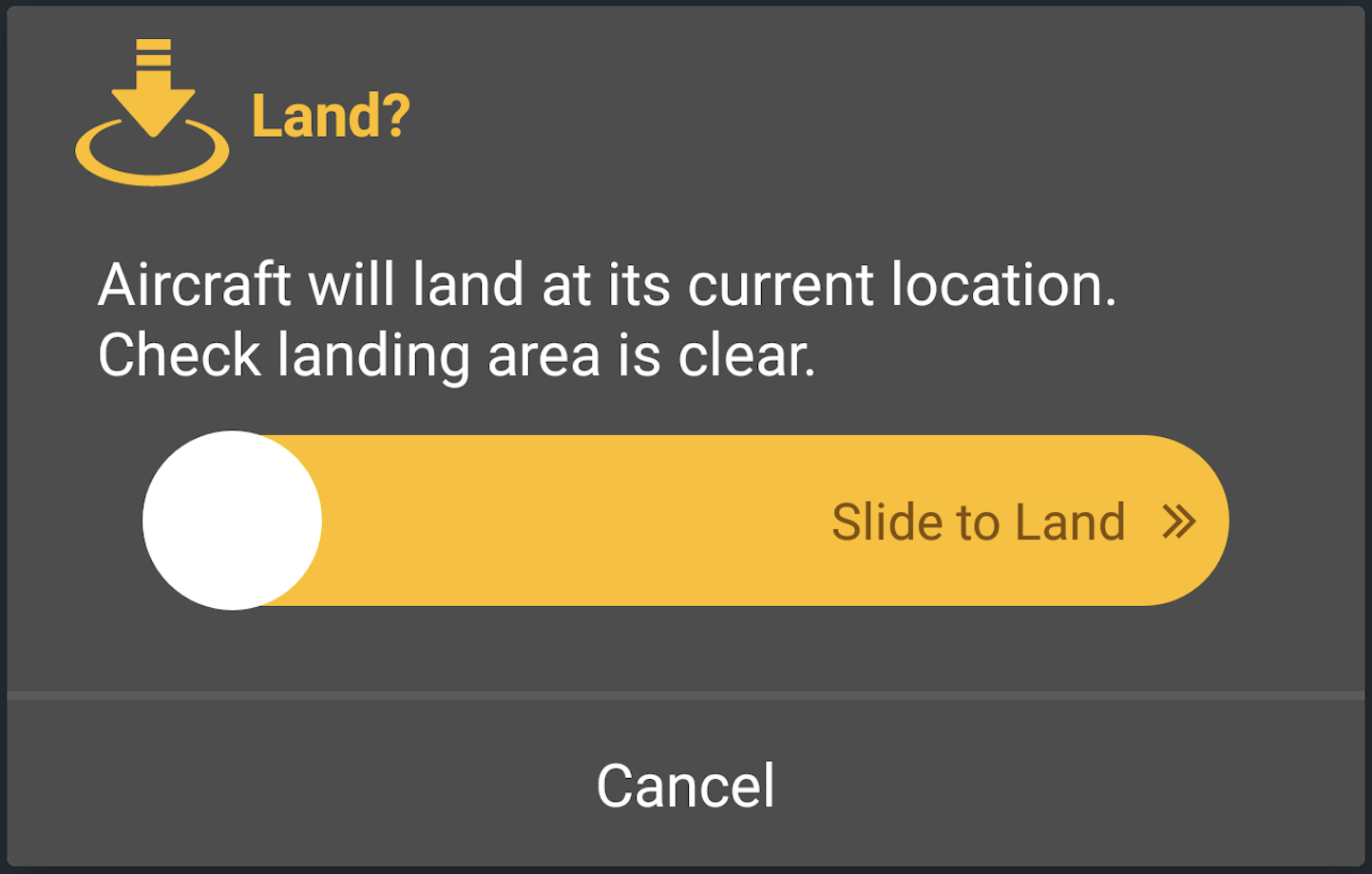
Ready to Land | The aircraft is flying. Tapping will show a dialog to confirm landing |  |
 |
Landing In Progress | The aircraft is landing | N/A |
 |
Forced Landing In Progress | The aircraft is landing and it cannot be canceled | N/A |
| Hidden | Disconnected | The aircraft is disconnected | N/A |
| Hidden | Return To Home In Progress | The aircraft is returning home. Use the Return Home Widget to allow the user to cancel this action. | N/A |
The checkbox in the takeoff dialog will only appear when a precision takeoff is possible, and if it is checked when the slider is dragged to the right edge, the aircraft will start a precision takeoff.

When landing confirmation is required at a height of 0.3 meters above the ground, the widget will show a landing confirmation dialog.

Additionally, this widget will show a dialog if landing is in progress, but it is currently unsafe to land. The dialog will prompt the user whether or not they want to cancel landing.

When the slider is dragged to the right edge of the dialog, the action described in the dialog is done and the dialog is dismissed. If the cancel button is pressed, no action is done and the dialog is dismissed.

<dji.ux.beta.flight.widget.takeoff.TakeOffWidget
    android:id="@+id/widget_takeoff"
    android:layout_width="40dp"
    android:layout_height="40dp" />
The ideal dimension ratio for this widget is 1:1
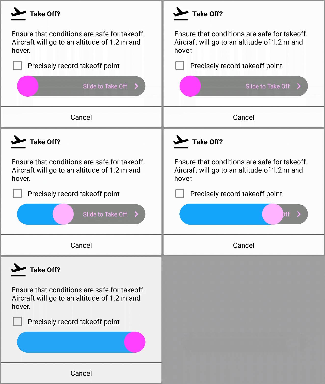
The UI elements can be customized to match the style of the user's application. The customizations can be done using attributes in XML or programmatically using the APIs.
<dji.ux.beta.flight.widget.takeoff.TakeOffWidget
        android:id="@+id/widget_take_off"
        android:layout_width="40dp"
        android:layout_height="40dp"
        app:uxsdk_takeOffActionDrawable="@drawable/ic_flight_takeoff_white_24dp"
        app:uxsdk_landActionDrawable="@drawable/ic_flight_land_white_24dp"
        app:uxsdk_cancelLandActionDrawable="@drawable/custom_cancel_landing_selector"
        app:uxsdk_takeOffDialogIcon="@drawable/ic_flight_takeoff_black_24dp"
        app:uxsdk_landingDialogIcon="@drawable/ic_flight_land_black_24dp"
        app:uxsdk_landingConfirmationDialogIcon="@drawable/ic_flight_land_black_24dp"
        app:uxsdk_unsafeToLandDialogIcon="@drawable/ic_flight_land_black_24dp"
        app:uxsdk_dialogTitleTextColor="@color/black"
        app:uxsdk_dialogMessageTextColor="@color/black"
        app:uxsdk_dialogCheckBoxMessageTextColor="@color/black"
        app:uxsdk_dialogCancelTextColor="@color/black"
        app:uxsdk_dialogSliderFillColor="@color/blue"
        app:uxsdk_dialogSliderThumbColor="#@color/pink"
        app:uxsdk_dialogSliderThumbSelectedColor="#@color/light_pink"
        app:uxsdk_dialogSliderMessageBackground="@drawable/custom_slider_background"
        app:uxsdk_dialogSliderMessageTextColor="#@color/light_pink"
        app:uxsdk_dialogBackground="@color/white"
        app:uxsdk_dialogSliderIcon="@drawable/ic_chevron_right_pink_24dp"
        app:uxsdk_dialogTheme="@style/TakeOffDialogTheme" />

List of the customizable XML attributes
-
uxsdk_takeOffActionDrawable- The icon shown when the state of the widget is Ready to Take Off -
uxsdk_landActionDrawable- The icon shown when the state of the widget is Ready to Land -
uxsdk_cancelLandActionDrawable- The icon shown when the state of the widget is Landing In Progress -
uxsdk_takeOffDialogIcon- The icon shown in the take off dialog -
uxsdk_landingDialogIcon- The icon shown in the landing dialog -
uxsdk_landingConfirmationDialogIcon- The icon shown in the landing confirmation dialog -
uxsdk_unsafeToLandDialogIcon- The icon shown in the unsafe to land dialog -
uxsdk_dialogTitleTextAppearance- The text appearance of the title for all the dialogs shown by this widget -
uxsdk_dialogTitleTextSize- The text size of the title for all the dialogs shown by this widget -
uxsdk_dialogTitleTextColor- The text color of the title for all the dialogs shown by this widget -
uxsdk_dialogTitleBackground- The background of the title for all the dialogs shown by this widget -
uxsdk_dialogMessageTextAppearance- The text appearance of the message for all the dialogs shown by this widget -
uxsdk_dialogMessageTextSize- The text size of the message for all the dialogs shown by this widget -
uxsdk_dialogPrecisionMessageTextSize- The text size of the precision takeoff message for the take off dialog -
uxsdk_dialogMessageTextColor- The text color of the message for all the dialogs shown by this widget -
uxsdk_dialogMessageBackground- The background of the message for all the dialogs shown by this widget -
uxsdk_dialogCheckBoxMessageTextAppearance- The text appearance of the precision checkbox message for the takeoff dialog -
uxsdk_dialogCheckBoxMessageTextSize- The text size of the precision checkbox message for the takeoff dialog -
uxsdk_dialogCheckBoxMessageTextColor- The text color of the precision checkbox message for the takeoff dialog -
uxsdk_dialogCheckBoxMessageBackground- The background of the precision checkbox message for the takeoff dialog -
uxsdk_dialogCancelTextAppearance- The text appearance of the cancel button for all the dialogs shown by this widget -
uxsdk_dialogCancelTextSize- The text size of the cancel button for all the dialogs shown by this widget -
uxsdk_dialogCancelTextColor- The text color of the cancel button for all the dialogs shown by this widget -
uxsdk_dialogCancelBackground- The background of the cancel button for all the dialogs shown by this widget -
uxsdk_dialogSliderMessageTextAppearance- The text appearance of the slider message for all the dialogs shown by this widget -
uxsdk_dialogSliderMessageTextSize- The text size of the slider message for all the dialogs shown by this widget -
uxsdk_dialogSliderMessageTextColor- The text color of the slider message for all the dialogs shown by this widget -
uxsdk_dialogSliderMessageBackground- The background of the slider message for all the dialogs shown by this widget -
uxsdk_dialogSliderIcon- The icon to the right of the slider message for all the dialogs shown by this widget -
uxsdk_dialogSliderThumbColor- The color of the slider thumb for all the dialogs shown by this widget -
uxsdk_dialogSliderThumbSelectedColor- The color of the slider thumb when selected for all the dialogs shown by this widget -
uxsdk_dialogSliderFillColor- The fill color of the slider for all the dialogs shown by this widget -
uxsdk_dialogBackground- The background of all the dialogs shown by this widget -
uxsdk_dialogTheme- The theme of the dialogs
TakeOffWidget takeOffWidget = findViewById(R.id.widget_take_off);
takeOffWidget.setTakeOffActionIcon(R.drawable.ic_flight_takeoff_white_24dp);
takeOffWidget.setLandActionIcon(R.drawable.ic_flight_land_white_24dp);
takeOffWidget.setCancelLandActionIcon(R.drawable.custom_cancel_landing_selector);
takeOffWidget.setTakeOffDialogIcon(R.drawable.ic_flight_takeoff_black_24dp);
takeOffWidget.setLandingDialogIcon(R.drawable.ic_flight_land_black_24dp);
takeOffWidget.setLandingConfirmationDialogIcon(R.drawable.ic_flight_land_black_24dp);
takeOffWidget.setUnsafeToLandDialogIcon(R.drawable.ic_flight_land_black_24dp);
takeOffWidget.setDialogTitleTextColor(getResources().getColor(R.color.black));
takeOffWidget.setDialogMessageTextColor(getResources().getColor(R.color.black));
takeOffWidget.setDialogCheckBoxMessageTextColor(getResources().getColor(R.color.black));
takeOffWidget.setDialogCancelTextColor(getResources().getColor(R.color.black));
takeOffWidget.setDialogSliderFillColor(getResources().getColor(R.color.blue));
takeOffWidget.setDialogSliderThumbColor(getResources().getColor(R.color.pink));
takeOffWidget.setDialogSliderThumbSelectedColor(getResources().getColor(R.color.light_pink));
takeOffWidget.setDialogSliderMessageBackground(getResources().getDrawable(R.drawable.custom_slider_background));
takeOffWidget.setDialogSliderMessageTextColor(getResources().getColor(R.color.light_pink));
takeOffWidget.setDialogBackground(new ColorDrawable(getResources().getColor(R.color.white)));
takeOffWidget.setDialogSliderIcon(getResources().getDrawable(R.drawable.ic_chevron_right_pink_24dp));
takeOffWidget.setDialogTheme(R.style.TakeOffDialogTheme);val takeOffWidget = findViewById<TakeOffWidget>(R.id.widget_take_off)
takeOffWidget.setTakeOffActionIcon(R.drawable.ic_flight_takeoff_white_24dp)
takeOffWidget.setLandActionIcon(R.drawable.ic_flight_land_white_24dp)
takeOffWidget.setCancelLandActionIcon(R.drawable.custom_cancel_landing_selector)
takeOffWidget.setTakeOffDialogIcon(R.drawable.ic_flight_takeoff_black_24dp)
takeOffWidget.setLandingDialogIcon(R.drawable.ic_flight_land_black_24dp)
takeOffWidget.setLandingConfirmationDialogIcon(R.drawable.ic_flight_land_black_24dp)
takeOffWidget.setUnsafeToLandDialogIcon(R.drawable.ic_flight_land_black_24dp)
takeOffWidget.dialogTitleTextColor = resources.getColor(R.color.black)
takeOffWidget.dialogMessageTextColor = resources.getColor(R.color.black)
takeOffWidget.dialogCheckBoxMessageTextColor = resources.getColor(R.color.black)
takeOffWidget.dialogCancelTextColor = resources.getColor(R.color.black)
takeOffWidget.dialogSliderFillColor = resources.getColor(R.color.blue)
takeOffWidget.dialogSliderThumbColor = resources.getColor(R.color.pink)
takeOffWidget.dialogSliderThumbSelectedColor = resources.getColor(R.color.light_pink)
takeOffWidget.dialogSliderMessageBackground = resources.getDrawable(R.drawable.custom_slider_background)
takeOffWidget.dialogSliderMessageTextColor = resources.getColor(R.color.light_pink)
takeOffWidget.dialogBackground = ColorDrawable(resources.getColor(R.color.white))
takeOffWidget.dialogSliderIcon = resources.getDrawable(R.drawable.ic_chevron_right_pink_24dp)
takeOffWidget.dialogTheme = R.style.TakeOffDialogThemeThe icon for the Forced Landing In Progress state can be customized by creating a StateListDrawable when customizing the cancel land action icon and using the "android:state_enabled="false" attribute for the cancel landing disabled icon.
<selector xmlns:android="http://schemas.android.com/apk/res/android">
    <item
        android:state_enabled="false"
        android:drawable="@drawable/ic_stop_circle_gray_24dp" />
    <item
        android:drawable="@drawable/ic_stop_circle_white_24dp" />
</selector>
The checkbox and button colors of the warning dialog can be customized using a custom theme. Use colorAccent to customize the color of the checked checkbox, and use android:textColorSecondary to customize the color of the unchecked checkbox.
<style name="TakeOffDialogTheme" parent="Theme.AppCompat.Dialog.Alert">
    <item name="colorAccent">#FF00FF</item>
    <item name="android:textColorSecondary">@color/dark_gray</item>
</style>List of the customization APIs
-
var dialogTheme: Int- The theme of the dialogs -
var takeOffActionIcon: Drawable?- The icon shown when the state of the widget is Ready to Take Off -
var landActionIcon: Drawable?- The icon shown when the state of the widget is Ready to Land -
var cancelLandActionIcon: Drawable?- The icon shown when the state of the widget is Landing In Progress -
var takeOffDialogIcon: Drawable?- The icon shown in the take off dialog -
var landingDialogIcon: Drawable?- The icon shown in the landing dialog -
var landingConfirmationDialogIcon: Drawable?- The icon shown in the landing confirmation dialog -
var unsafeToLandDialogIcon: Drawable?- The icon shown in the unsafe to land dialog -
var dialogTitleTextSize: Float- The text size of the title for all the dialogs shown by this widget -
var dialogTitleTextColor: Int- The text color of the title for all the dialogs shown by this widget -
var dialogTitleBackground: Drawable?- The background of the title for all the dialogs shown by this widget -
var dialogMessageTextSize: Float- The text size of the message for all the dialogs shown by this widget -
var dialogPrecisionMessageTextSize: Float- The text size of the precision takeoff message for the take off dialog -
var dialogMessageTextColor: Int- The text color of the message for all the dialogs shown by this widget -
var dialogMessageBackground: Drawable?- The background of the message for all the dialogs shown by this widget -
var dialogCheckBoxMessageTextSize: Float- The text size of the precision checkbox message for the takeoff dialog -
var dialogCheckBoxMessageTextColor: Int- The text color of the precision checkbox message for the takeoff dialog -
var dialogCheckBoxMessageBackground: Drawable?- The background of the precision checkbox message for the takeoff dialog -
var dialogCancelTextSize: Float- The text size of the cancel button for all the dialogs shown by this widget -
var dialogCancelTextColor: Int- The text color of the cancel button for all the dialogs shown by this widget -
var dialogCancelTextColors: ColorStateList?- The text colors of the cancel button for all the dialogs shown by this widget -
var dialogCancelBackground: Drawable?- The background of the cancel button for all the dialogs shown by this widget -
var dialogSliderMessageTextSize: Float- The text size of the slider message for all the dialogs shown by this widget -
var dialogSliderMessageTextColor: Int- The text color of the slider message for all the dialogs shown by this widget -
var dialogSliderMessageBackground: Drawable?- The background of the slider message for all the dialogs shown by this widget -
var dialogSliderIcon: Drawable?- The icon to the right of the slider message for all the dialogs shown by this widget -
var dialogSliderThumbColor: Int- The color of the slider thumb for all the dialogs shown by this widget -
var dialogSliderThumbSelectedColor: Int- The color of the slider thumb when selected for all the dialogs shown by this widget -
var dialogSliderFillColor: Int- The fill color of the slider for all the dialogs shown by this widget -
var dialogBackground: Drawable?- The background of all the dialogs shown by this widget -
fun setTakeOffActionIcon(@DrawableRes resourceId: Int)- Set the icon shown when the state of the widget is Ready to Take Off -
fun setLandActionIcon(@DrawableRes resourceId: Int)- Set the icon shown when the state of the widget is Ready to Land -
fun setCancelLandActionIcon(@DrawableRes resourceId: Int)- Set the icon shown when the state of the widget is Landing In Progress -
fun setTakeOffDialogIcon(@DrawableRes resourceId: Int)- Set the icon shown in the take off dialog -
fun setLandingDialogIcon(@DrawableRes resourceId: Int)- Set the icon shown in the landing dialog -
fun setLandingConfirmationDialogIcon(@DrawableRes resourceId: Int)- Set the icon shown in the landing confirmation dialog -
fun setUnsafeToLandDialogIcon(@DrawableRes resourceId: Int)- Set the icon shown in the unsafe to land dialog -
fun setDialogTitleTextAppearance(@StyleRes textAppearance: Int)- Set the text appearance of the title for all the dialogs shown by this widget -
fun setDialogMessageTextAppearance(@StyleRes textAppearance: Int)- Set the text appearance of the message for all the dialogs shown by this widget -
fun setDialogCheckBoxMessageTextAppearance(@StyleRes textAppearance: Int)- Set the text appearance of the precision checkbox message for the takeoff dialog -
fun setDialogCancelTextAppearance(@StyleRes textAppearance: Int)- Set the text appearance of the cancel button for all the dialogs shown by this widget -
fun setDialogSliderMessageTextAppearance(@StyleRes textAppearance: Int)- Set the text appearance of the slider message for all the dialogs shown by this widget
The widget provides hooks for users to add functionality based on state changes in the widget. The Take Off widget provides the following hooks
-
ModelState- Provides hooks in events received by the widget from the widget model.
-
data class ProductConnected(val isConnected: Boolean) : ModelState()- Event when product is connected or disconnected. -
data class TakeOffLandingStateUpdated(val state: TakeOffLandingState) : ModelState()- Event when TakeOffLandingState is updated. -
object TakeOffStartSucceeded : ModelState()- Event when aircraft takeoff is successful. -
data class TakeOffStartFailed(val error: UXSDKError) : ModelState()- Event when aircraft takeoff fails. -
object PrecisionTakeOffStartSucceeded : ModelState()- Event when aircraft precision takeoff is successful. -
data class PrecisionTakeOffStartFailed(val error: UXSDKError) : ModelState()- Event when aircraft precision takeoff fails. -
object LandingStartSucceeded : ModelState()- Event when aircraft landing has started successful. -
data class LandingStartFailed(val error: UXSDKError) : ModelState()- Event when aircraft landing has not started due to an error. -
object LandingConfirmSucceeded : ModelState()- Event when landing confirmation has been sent successfully. -
data class LandingConfirmFailed(val error: UXSDKError) : ModelState()- Event when landing confirmation was not sent due to an error. -
object LandingCancelSucceeded : ModelState()- Event when landing was canceled successfully. -
data class LandingCancelFailed(val error: UXSDKError) : ModelState()- Event when landing was not canceled due to an error.
The user can subscribe to this using fun getWidgetStateUpdate(): Flowable<ModelState>.
-
UIState- Provides hooks in events related to user interaction with the widget.
-
object WidgetClicked : UIState()- Event when widget is clicked. -
data class DialogDisplayed(val info: Any?) : UIState()- Event when a dialog is displayed. -
data class DialogActionConfirmed(val info: Any?) : UIState()- Event when the positive button on the dialog is clicked. -
data class DialogActionCancelled(val info: Any?) : UIState()- Event when the negative button on the dialog is clicked. -
data class DialogDismissed(val info: Any?) : UIState()- Event when a dialog is dismissed. -
data class DialogCheckboxCheckChanged(val info: Any?) : UIState()- Event when checkbox state in the dialog is changed.
The info param is an instance of DialogType and can be used as a dialog identifier. Its types are
-
TakeOff- The takeoff dialog, which is shown when the widget is clicked and the aircraft is ready to take off. -
Landing- The landing dialog, which is shown when the widget is clicked and the aircraft is ready to land. -
LandingConfirmation- The landing confirmation dialog, which is shown when the aircraft has paused auto-landing and is waiting for confirmation before continuing. -
UnsafeToLand- The unsafe to land dialog, which is shown when the aircraft is auto-landing and has determined it is unsafe to land.
The user can subscribe to this using fun getUIStateUpdates(): Flowable<UIState>.
DJI UX SDK Version 5 Beta 5
UX SDK 5.0 Overview
Core Module
Camera Core Module
Visual Cameras Module
- Camera Config