-
Notifications
You must be signed in to change notification settings - Fork 8.3k
New issue
Have a question about this project? Sign up for a free GitHub account to open an issue and contact its maintainers and the community.
By clicking “Sign up for GitHub”, you agree to our terms of service and privacy statement. We’ll occasionally send you account related emails.
Already on GitHub? Sign in to your account
MEGA THREAD: Design still subject to change, UI is pretty okay though #1375
Comments
|
Yeah, I think we can all agree "make the tabs like Edge Chrome" is nice, but "make the tabs like the promo video" is even better ... 😣 |
|
I think the UWP Edge had nicer tabs than Edge Chrome. 🤔 |
|
Personally I wish they'd make Edge Chrome's tabs like UWP Edge, but nobody asked me... |
|
Yeah, yeah, but ... either of them is waaaay ahead of Terminal 🤡 |
|
Selecting and dragging anywhere within the tab area currently does not move the window. This makes it necessary to move the mouse to the right of the tab area, which leaves a very small amount of titlebar which can be used to move the window. Please change this. No rush! |
|
|
If the tab bar can't be acrylic, that's a major shame. The non drag-able tab/title bar is the #1 complaint I've heard from everyone that has tried the early builds Split panes need some visual polish, make it clear which is in focus, some animation even as it opens |
|
Tabs show the path to the executable instead of the name of the app; if the path is too long, the "x" to close the tab is pushed off the right side of the tab and is invisible. Clicking "Settings" attempts to open a JSON file. I'm guessing that the UI for that hasn't been built yet. :) |
|
As an addition to @robster2001's comments, it'd be nice if each tab showed the actual path like Ubuntu and if it was in administrator mode (e.g. Command Prompt (Admin) - C:\current\path\that\you\are\in). When you don't have terminal maximized, as I usually don't, the issue #857 combined with the long titles allows for much less tabs than what it could be. |
|
The tabs are just too wide to be useful. Perhaps just show the executable and give the path/etc information when you hover over the tab in a tooltip or something. |
|
Two things: If you want a custom tab title, you should look at how to set that up for your shell. It’ll benefit you everywhere you use your shell. By making powershell set the title, you change the title for Windows Terminal, legacy console, VSCode, ConEmu and a bunch of other things. It can even change in the middle of a session! |
|
Panes epic: #1000 |
|
I couldn't find anywhere along the caption at the top of the window that allowed me to drag and move the window. I had to resort to keyboard shortcuts. |
|
two-finger scrolling doesn't work, although it works great on cmd.com and PowerShell. |
|
Tabs cannot be moved/rearranged. |
|
|
|
Thanks @Tropix126. We are trying to move to WinUI 2.6 so we can get their styling work, but we're currently blocked by microsoft/microsoft-ui-xaml#5435. I've engaged with the WinUI team internally to hopefully get us past this. |
Made some changes to the search box: * Adjusted spacing inside the box * Detached the search box from the titlebar (as explained [here](#1375 (comment))) * The search box is now 8px further to the left, in case the scrollbar is always enabled * Made some controls use default properties, so that they'll adjust nicely to the 2.6 styles Other: the search box and command palette now use OverlayCornerRadius Before/After: 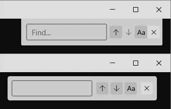
|
Looks like efforts have started on MUX 2.7 adoption in #11720. |
This comment was marked as off-topic.
This comment was marked as off-topic.
This comment was marked as off-topic.
This comment was marked as off-topic.
This comment was marked as off-topic.
This comment was marked as off-topic.
|
The above work is something we're tracking in #3327. There's more discussion there, so I'll redirect the above couple comments to that thread instead. Thanks! |
|
Dragging the window above the taps is still not supported yet? I just somehow accidentally moved my window too far to the right and I couldn't reach the draggable zone anymore. |
|
Hey all, I'm gonna finally close this thread out with the release of Windows Terminal 1.17. This release finally adds support for Mica, and with that, I'm gonna call this "done". I think we've settled enough on what the design of the Terminal is going to be going forward, and we've established a mechanism (through Themes) for users to add additional UI customizations as they see fit. There's been a large number of minor suggestions for changes to the UI that have accumulated in this thread over the years. I'm under the impression that these should all be tracked as sub-points in our "Themes megrathread", #3327, at this point (my apologies if I missed anyone). Obviously, these aren't all done, but the fundamental framework is now in place for storing these Theme settings, so when these features are ever added, exposing them as optional settings should be "easy". There's also other minor functional nits (like #5493) which don't really need this megathread tracking them anymore. Thanks to the 145 of you who have commented on this thread, and countless more of you following for updates. It's hard to believe how far the Terminal has come over the years, from v0.1 to what's possible today: I'm really happy with the way this has all come together over the years, and that wouldn't have been possible without the absolute breadth of feedback we've gotten here (and in other threads) ❤️ |

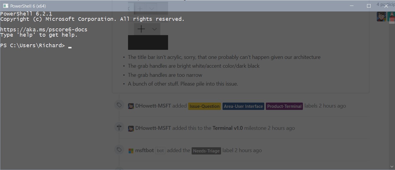

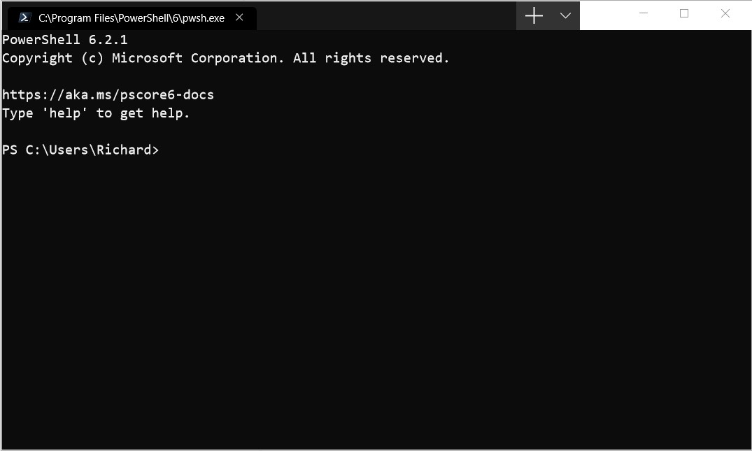


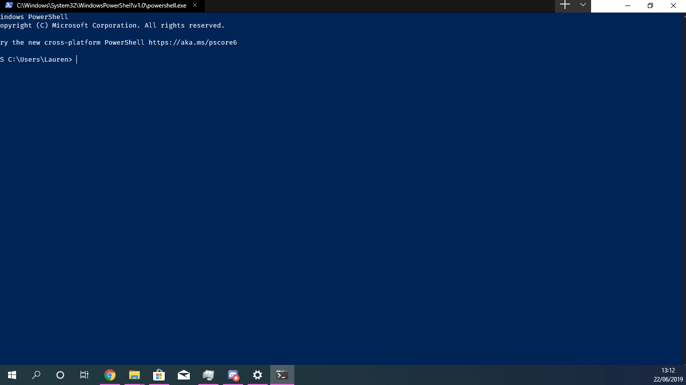


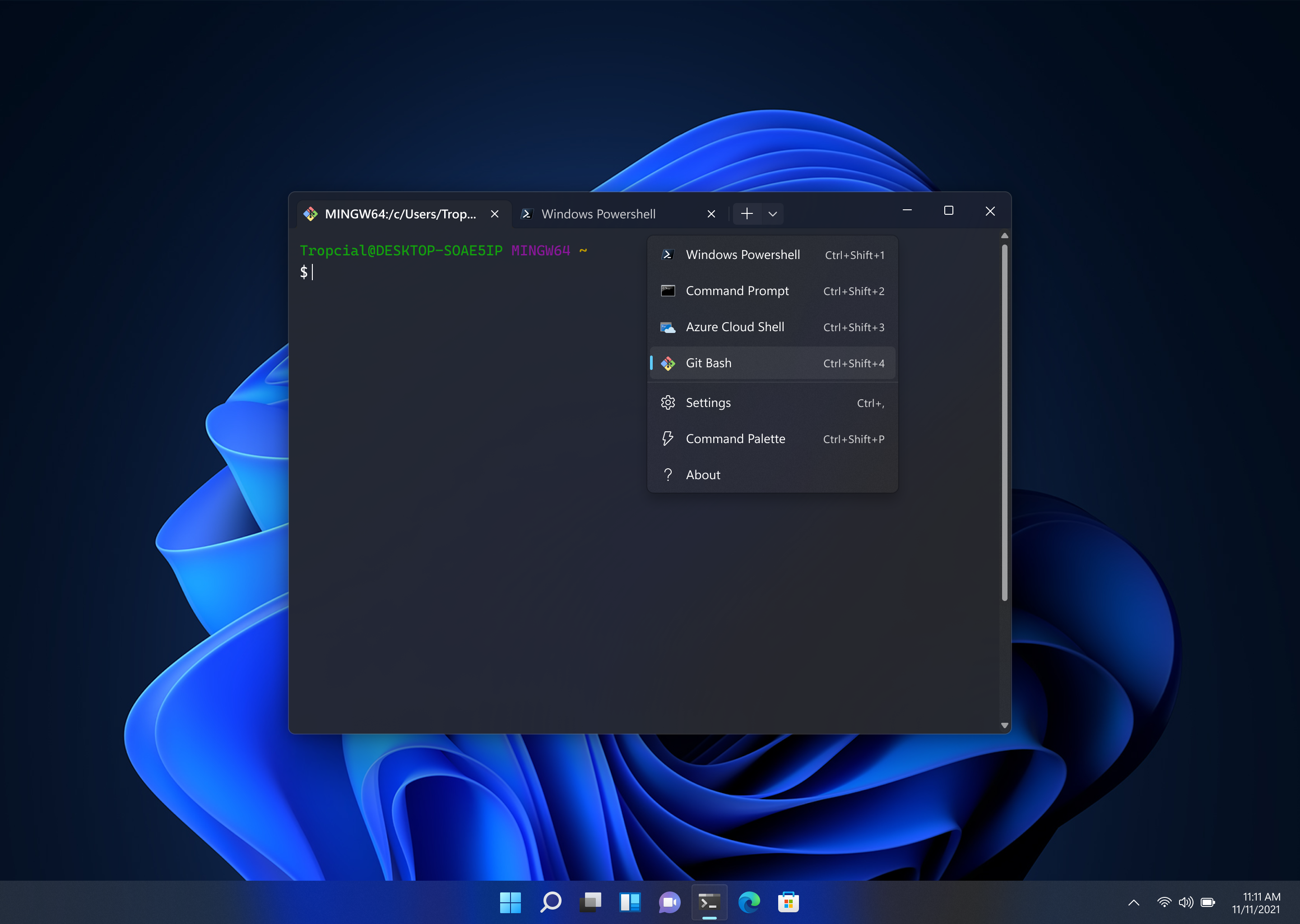
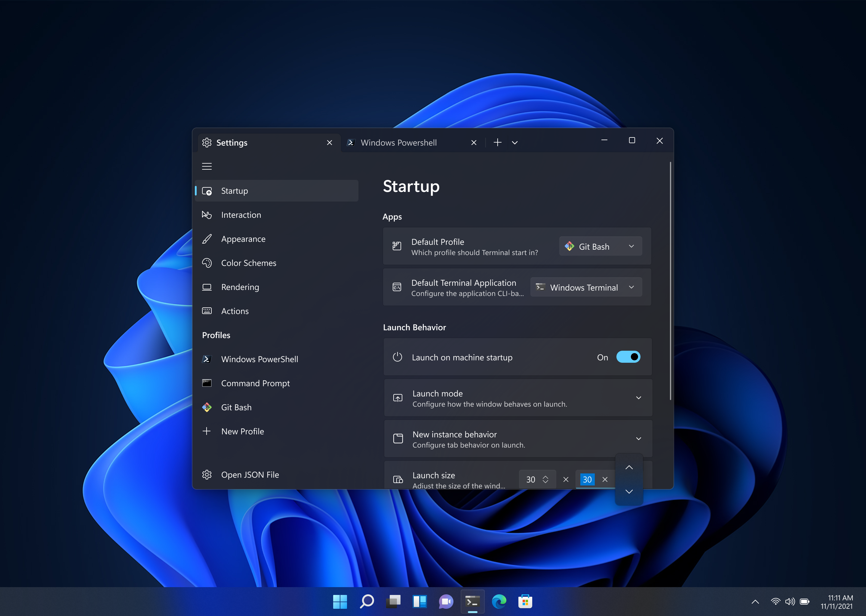
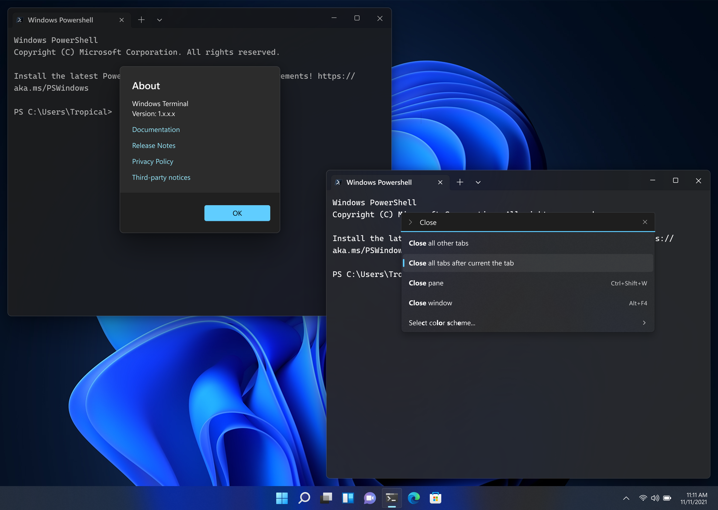


I am creating this so I can pin it & to help keep track of several related issues/work-items.
Things we know:
Cascade Windows,Show windows stackedetc is completely ignored by TerminalThings related to tabs:
Things that people want, but we won't be able to fix:
Things fixed in v0.6:
Things fixed in v0.5:
Things fixed in v0.3:
The non-client area looks wrong; PR Apply a GDI region to the top level Island window to allow dragging with a single Xaml Island #929, Issue We need to draw the whole non-client area ourselves #872


The plus button is too big, too small, too wide, too narrow (fixed in Style the button and tab view background to match the titlebar #1934)

Use tab-bar/title bar for dragging window around #564 draggable area in title bar (PR Enable dragging with the entire titlebar #1948)
When maximized on displays with a different DPI, the edges of the window are cut off. (Fixed by Fix wrong maximized window offset on non primary monitors #1921)
Feature request: suppress VT title and prefer profile name (or something else) #608 the text of my tabs is too long
I'm using the dark theme but am still seeing a white border and header are still white. (Might be fixed by Apply a GDI region to the top level Island window to allow dragging with a single Xaml Island #929)

(caused by Apply a GDI region to the top level Island window to allow dragging with a single Xaml Island #929, tracked in

Epic: Fix remaining issues with non-client drawing #1625Add a setting to enable the using the Accent Color for the titlebar #1963) The titlebar does not have my accent color in itResizing the window causes the UI to disapper/reappear.

The text was updated successfully, but these errors were encountered: