Office HTML and CSS Style Guide
CORE uses Bootstrap for Office pages. See Tips for Bootstrap for some basic pointers. *
Pages shall include the standard header and footer. The easiest way to do this is by by subclassing FanniePage and setting the $themed property to true. Other approaches may work at developer discretion. Exceptions to this rule will be maintained here and fairly limited.
- The reprint receipt does not include a menu or footer. Justification: this is frequently printed.
- HTML report output does not include a menu or footer. Justification: javascript for sorting results doesn't play nice with bootstrap. This exception is currently being debated and may be removed in a future release.
- Pages displayed in a lightbox or overlay on top of another page may omit menus and footers.
- Pages that have not yet been updated to support Bootstrap may use an old-style left-hand menu. Updating these pages is highly encouraged.
HTML should not use inline styles (i.e., a style attribute on a tag). CSS should be applied via stylesheets. Use CSS classes defined in:
- Bootstrap
- fannie/src/css/core.css
- fannie/src/css/configurable.php
CORE reserves the right to put into place more formal processes for updating project stylesheets in the interest of consistency.
Form <input>s and <select>s should use the Bootstrap CSS class form-control for standard appearance. If screen space is constrained, the input-sm CSS class may be used to decrease the size of input elements. Form buttons should use the <button> tag with CSS classes btn and btn-default. Inputs that make use of an input-group-addon such as a dollar or percentage sign should use a CSS class hinting at width in ems (e.g., price-field) to prevent Google Chrome's rendering engine from going crazy.
Forms can be displayed in a single column, a single row, two columns, or a table. A single column layout is best for forms with a small number of inputs. The label and inputs should be grouped together in a form-group <div> such that the label appears above the input and left-aligned. If significant scrolling is required to view all inputs, single column is not a good choice.

A single row form should use the form-inline CSS class with labels appearing the left of their inputs. This type of form is appropriate for a small number of inputs appearing above or below a large block of content such as a table of data.

A two column layout is a common choice for report forms. A two column layout has two columns of inputs with each column defined using Bootstrap's grid width CSS classes. Within each column are label and input pairs. Each pair should be one line with labels right-aligned. All inputs within the column should be the same width and alignment. Sizing the label and input elements using grid width classes is the best way to do that.

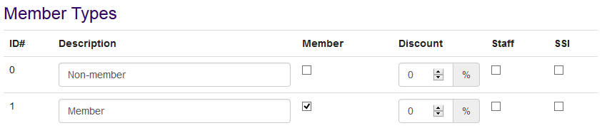
A table layout should be used with very dense forms containing a large number of inputs. Tabular forms make the most sense in situations where the user is editing multiple records simultaneously with each row of inputs corresponding to a single record.
Date inputs require extra considerations. All date inputs should use the CSS class date-field to enable a jQueryUI date widget when the field has focus. Any form providing a pair of date inputs should also include CORE's date range picker (FormLib::dateRangePicker) for quickly selecting common ranges.
In particular, the arrangement of inputs is all over the place. I don't think there's a one-size-fits-all solution since arrangement is occasionally functional to fit a large quantity of info on screen, but a handful of layouts that cover most common scenarios would be helpful. I like this markup a lot for a layout with two columns of inputs: https://github.com/CORE-POS/IS4C/blob/master/fannie/item/shrink/ShrinkTool.php#L124-188
A good old issue going back nearly forever! Currently the only place the menu doesn't show up (by default) is on report results. Adding the menu onto report results causes some weirdness in how Bootstrap and tablesorter 2.0 interact. This is mostly resolved at this point. Upstream now includes a newer, Bootstrap-compatible tablesorter 2.22. The default is currently unchanged and menus are omitted from reports, but enabling the always-on menu setting automatically switches over to the newer tablesorter version. I'm fairly tempted to switch the default (or even just get rid of the setting) and make the menu always-on out of the box. I'll probably hold off for a later release though at this point.
The pain point here is reset buttons on forms. Clicking a reset button by accident is annoying. When forms include both a submit button and a reset button, they ought to appear in a predictable (I happen to prefer submit on the left but others may disagree) with some reasonable, defined space in between to prevent accidental clicks. The submit button also ought to be highlighted in some way. I'm leaning towards a colored border. That's partially just to avoid another setting. Since colors are customizable now, a colored button raises issues about what color the text should be given the user's chosen color.